📓3.2: UI Components
Table of Contents
Bootstrap’s User Interface (UI) Components
Bootstrap components are pre-styled, professional-looking UI elements like buttons, forms, navigation bars, and more – implemented simply by using Bootstrap’s class names in your HTML code.
- User Interface
- The way a user interacts with a device, such as a computer, website, or application.
- UI Component
- A reusable building block of a user interface (UI) that displays content in a certain way or performs a specific function.
📥 To use interactive elements like carousels (slideshows) and modals (pop-up windows), include the CDN link to Bootstrap’s JavaScript code too (under your <link> to the CSS code):
<script src="https://cdn.jsdelivr.net/npm/bootstrap@5.3.3/dist/js/bootstrap.bundle.min.js"></script>
Buttons
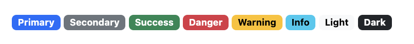
Bootstrap 5 provides nine predefined styles for buttons — each serving a different semantic purpose.
- Semantic
- In web design, semantic refers to the the practice of making design choices that convey the inherent meaning of the content on a webpage. For example, a green colored alert message is often used to indicate that a user action was successful.
Refer to Bootstrap’s official documentation on for more examples beyond those listed below.
To style a button, use Bootstrap’s .btn class, followed by the desired style. For example, class="btn btn-primary" results in a primary colored button.

<button type="button" class="btn btn-primary">Primary</button>
<button type="button" class="btn btn-secondary">Secondary</button>
<button type="button" class="btn btn-light">Light</button>
<button type="button" class="btn btn-dark">Dark</button>
Outline Buttons
In need of a button, but not the hefty background colors they bring? Replace the default modifier classes with the .btn-outline-* ones to remove all background images and colors on any button.

<button type="button" class="btn btn-outline-primary">Primary Outline</button>
Sizes
Fancy larger or smaller buttons? Add .btn-lg or .btn-sm for additional sizes.
<button type="button" class="btn btn-primary btn-lg">Larger</button>
<button type="button" class="btn btn-primary btn-sm">Smaller</button>
Badges
Bootstrap’s badge classes can be used to highlight additional information that’s appended to a string of text.
Refer to Bootstrap’s official documentation on for more examples beyond those listed below.
To create a badge, apply the .badge class, as well as one of the .bg-* contextual classes to the <span> element that represents the badge.
<h1>Example heading <span class="badge text-bg-primary">New</span></h1>
<h2>Example heading <span class="badge text-bg-secondary">New</span></h2>
Cards
A card is a container with light styling that you can place virtually any content into. It can make your pages look clear and cohesive! Plenty of styling options are available such as alignment, padding, colors, headings, and more.
Refer to Bootstrap’s official documentation on for more examples beyond those listed below.
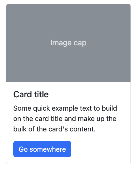
To create a basic card:
- Apply the
.cardand.card-bodyclasses to an element to create the outer card container. - Add
.card-titleto any heading elements and.card-textto text elements.<div class="card" style="max-width: 18rem;"> <div class="card-body"> <h5 class="card-title">Card title</h5> <p class="card-text">Some quick example text to make up the bulk of the card's content.</p> <a href="#" class="btn btn-primary">Go somewhere</a> </div> </div> - You can add a header with
.card-header, or a card image with.card-img-top:<div class="card" style="max-width: 18rem;"> <h5 class="card-header">Sponsored</div> <img src="..." class="card-img-top"> <div class="card-body"> <h5 class="card-title">Card title</h5> <p class="card-text">Some quick example text to make up the bulk of the card's content.</p> <a href="#" class="btn btn-primary">Go somewhere</a> </div> </div>
Alerts
Bootstrap provides an easy way to create a stylized alert message box with its alert component. Alerts make messages stand out, and can also offer contextual feedback messages for typical user actions.
Refer to Bootstrap’s official documentation on for more examples beyond those listed below.
To create an alert box, use the .alert class along with one of the .alert-* classes to specify the kind of alert.
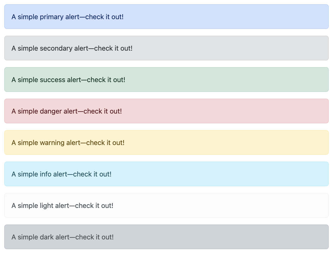
<div class="alert alert-success" role="alert">
  A simple success alert—check it out!
</div>
<div class="alert alert-danger" role="alert">
  A simple danger alert—check it out!
</div>
Modals
Bootstrap enables you to add a modal dialog box (pop-up window) to your site. A modal is a dialog box that takes the focus while the rest of the screen is dimmed or grayed out. This forces the user to take action on the dialog box before continuing.
Refer to Bootstrap’s official documentation on for more examples beyond those listed below.
Below is a static modal example (meaning its position and display have been overridden). Included are the modal header, modal body (required for padding), and modal footer (optional).
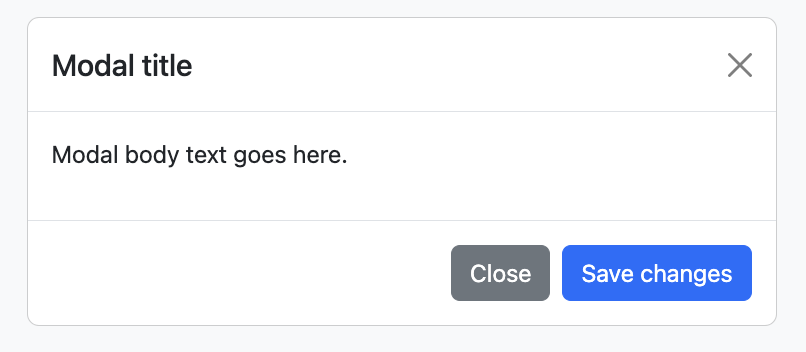
To create a modal, use the .modal class along with various other .modal-* classes to define each section of the modal.
<!-- Button trigger modal -->
<button type="button" class="btn btn-primary" data-bs-toggle="modal" data-bs-target="#exampleModal">
  Launch Modal
</button>

<!-- Modal -->
<div class="modal fade" id="exampleModal" tabindex="-1" aria-labelledby="exampleModalLabel" aria-hidden="true">
  <div class="modal-dialog">
    <div class="modal-content">
      <div class="modal-header">
        <h1 class="modal-title fs-5" id="exampleModalLabel">Modal title</h1>
        <button type="button" class="btn-close" data-bs-dismiss="modal" aria-label="Close"></button>
      </div>
      <div class="modal-body">
        ...
      </div>
    </div>
  </div>
</div>
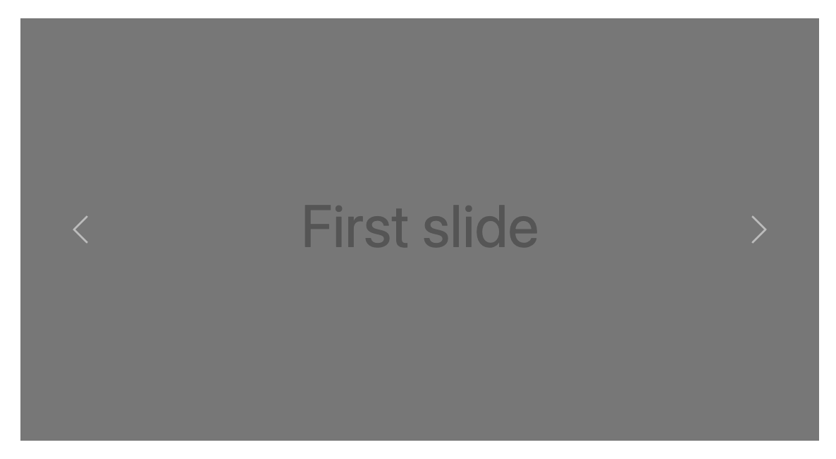
Carousels
The Bootstrap carousel component enables you to add scrolling images and text that slide in, pause, then slide out. Controls enable the user to scroll forwards or backwards within the set. Basically a scrolling slideshow with (optional) user controls.
Refer to Bootstrap’s official documentation on for more examples beyond those listed below.
To create a basic carousel with autoplay (no controls):
- Apply
.carouseland.slideto an outer container (with its own unique ID). - For the scrollable contents, wrap all items in a
.carousel-innerand give each item a.carousel-itemclass. - Also, you must apply
.activeto one of the slides in the carousel, otherwise the carousel won’t be visible. This class allows you to set one slide as the initial slide (i.e. the starting slide). - Use the
data-bs-rideattribute to auto-play the carousel.
<div id="carouselExample" class="carousel slide" data-bs-ride="carousel">
  <div class="carousel-inner">
    <div class="carousel-item active">
      <img src="..." class="d-block w-100">
    </div>
    <div class="carousel-item">
      <img src="..." class="d-block w-100">
    </div>
    <div class="carousel-item">
      <img src="..." class="d-block w-100">
    </div>
  </div>
</div>
Acknowledgement
Content on this page is adapted from Bootstrap 5 Tutorial - Quackit and the Bootstrap Documentation.