📓2.2: Positioning
Table of Contents
✴✴✴ NEW UNIT/SECTION! ✴✴✴
Create a blank website program to take your class notes in for the next few lessons.
Click on the collapsed heading below for GitHub instructions ⤵
📓 NOTES PROGRAM SETUP INSTRUCTIONS
- Go to the public template repository for our class: BWL-CS HTML/CSS/JS Template
- Click the button above the list of files then select
Create a new repository - Specify the repository name:
CS1-Unit-2-Notes-Position - For the description, write:
CSS manual positioning schemes (relative, absolute, fixed) - Click
Now you have your own personal copy of this starter code that you can always access under the
Your repositoriessection of GitHub! 📂 - Now on your repository, click and select the
Codespacestab - Click
Create Codespace on mainand wait for the environment to load, then you’re ready to code! - 📝 Take notes in this Codespace during class, writing code & comments along with the instructor.
🛑 When class ends, don’t forget to SAVE YOUR WORK! Codespaces are TEMPORARY editing environments, so you need to COMMIT changes properly in order to update the main repository for your program.
There are multiple steps to saving in GitHub Codespaces:
- Navigate to the
Source Controlmenu on the LEFT sidebar - Click the button on the LEFT menu
- Type a brief commit message at the top of the file that opens, for example:
updated index.html - Click the small
✔️checkmark in the TOP RIGHT corner - Click the button on the LEFT menu
- Finally you can close your Codespace!
CSS Positioning Modes
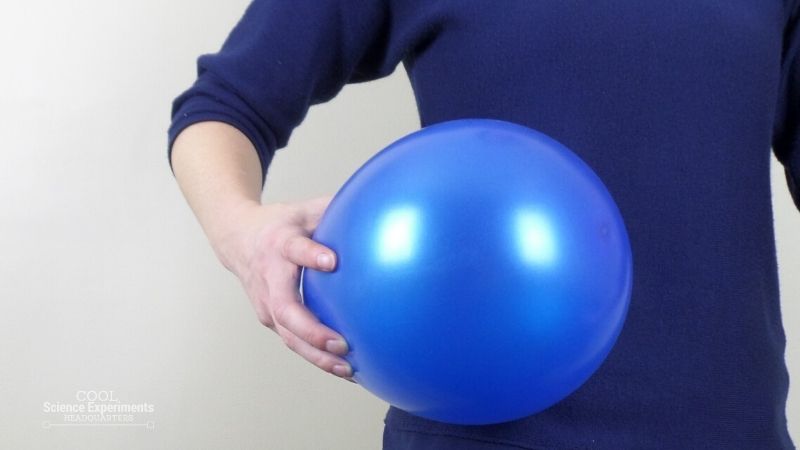
By now you have had quite a bit of practice moving elements around the screen using things like margin, padding, and flexbox. These techniques have all relied on CSS’s default positioning-mode: static. Static means the elements go along with the “normal flow” of the HTML document, much like a balloon with stored static electricity will stick to your sweater as you move:
This default positioning-mode is intuitive, and you’ll continue using it for almost all of your layout needs. However, there are other methods at your disposal that can be very useful in some situations.
Lesson overview
This section contains a general overview of topics that you will learn in this lesson.
- You’ll learn how to use
relativepositioning. - You’ll learn how to use
absolutepositioning. - You’ll learn how to use
fixedpositioning. - You’ll know the difference between each property and how to combine them.
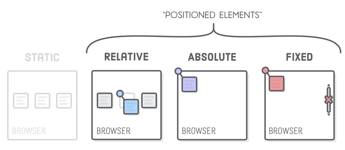
Relative Positioning
The default positioning mode that you’ve gotten used to is static. The difference between static and relative is fairly simple:
position: staticis the default position of every element, and unless thispositionproperty is changed fromstatic, the propertiestop,right,bottom, andleftdo not affect the position of the element.position: relativeon the other hand is pretty much the same as static, but propertiestop,right...(etc.)displace the element relative to its normal position in the flow of the document.
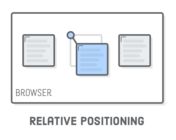
position: relative moves elements around relative to where they would normally appear in the static flow of the page. This is useful for nudging boxes around when the default flow is just a little bit off. Using any positioning scheme (other than static) enables specifying the location anywhere on the screen with the top, right, bottom, and left properties:
.item-relative {
  position: relative;
  top: 30px;
  left: 30px;
}
The
position: relative; line makes it a positioned element, and thetopandleftproperties let you define how far the element is offset from its static position.
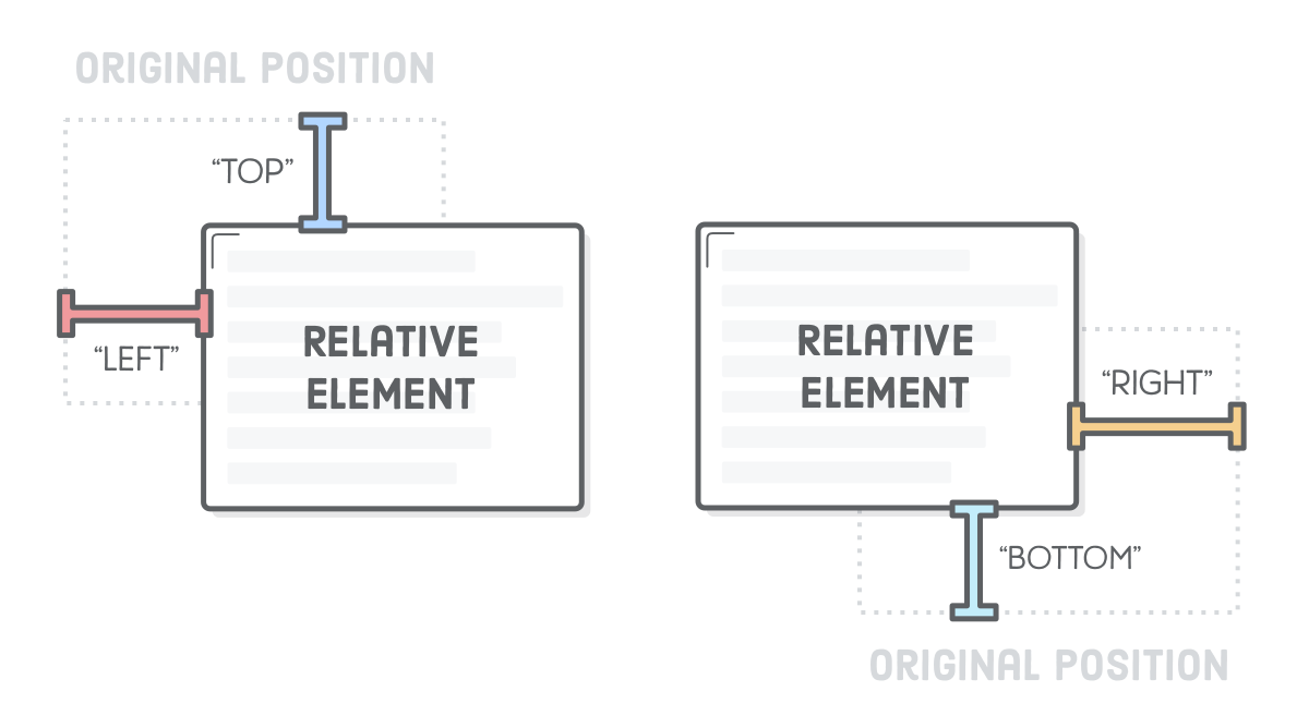
Note that these properties accept negative values, which means there’s two ways to specify the same offset. We could just as easily used top: -30px; in place of the bottom: 30px; declaration above.
Absolute Positioning
Absolute positioning is just like relative positioning, but the offset is relative to the entire browser window instead of the original position of the element. Since there’s no longer any relationship with the static flow of the page, consider this the most manual way to lay out an element.
position: absolute allows you to position something at an exact point on the screen without disturbing the other elements around it. Using an absolute positioning scheme enables specifying the location anywhere on the screen with the top, right, bottom, and left properties:
.item-absolute {
  position: absolute;
  top: 100px; /* 100px AWAY from TOP edge of page */
  left: 50%; /* 50% AWAY from LEFT edge of page */
}
The
position: absolute; line makes it a positioned element, and thetopandleftproperties let you define how far the element is offset from its static position. This is sort of like setting an (x, y) coordinate for the element.
More specifically, using absolute positioning on an element will remove that element from the normal document flow while being positioned relative to an ancestor element. To put it in other words: elements that are removed from the normal flow of the document do not affect other elements and are also not affected by other elements.
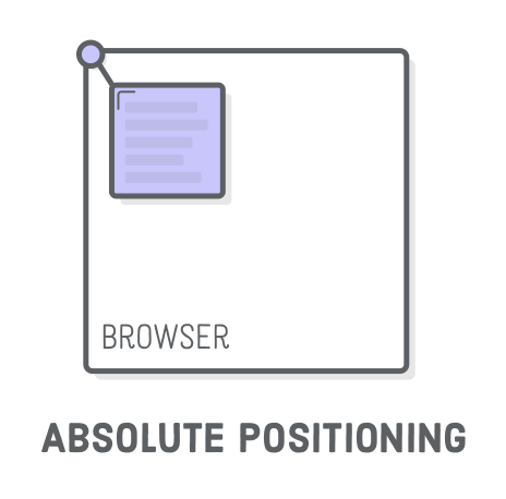
This property is really useful when you want to position something at an exact point on the screen, without disturbing any of the other elements on the page. A couple of good use cases for absolute positioning are: modals (pop up windows), image with a caption on it, icons on top of other elements, or if you’re making CSS art (our next project! 🎨)
In the following example, we are using absolute positioning to display text over an image.
See the Pen Absolute Position | CSS Positioning by TheOdinProject (@TheOdinProjectExamples) on CodePen.
Disclaimer: Absolute positioning has very specific use cases and if possible, using flex or grid layout schemes should be prioritized. Absolute positioning should NOT be used to do entire page layouts.
“Relatively-Absolute” Positioning
Absolute positioning becomes much more practical when it’s relative to some other element that IS in the static flow of the page. Fortunately, there’s a way to change the coordinate system of an absolutely positioned element. Coordinates for absolute elements are always relative to the closest container that is a positioned element. It only falls back to being relative to the browser when none of its ancestors are positioned.
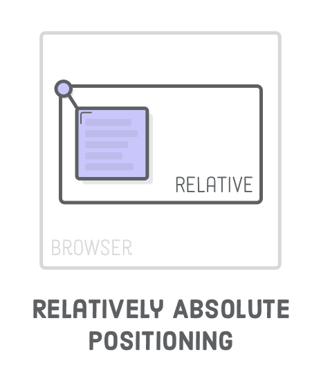
So, if we change .item-absolute’s parent element (let’s call it .container) to be relatively positioned, it should appear in the top-left corner of that element instead of the browser window:
.container {
  position: relative;
}
The
.containerdiv is still laid out with the normal flow of the page, and we can manually move around our.item-absoluteelement inside that div wherever we need to. This is great, because if we want to alter the normal flow of the container, say, for a mobile layout, any absolutely positioned elements will automatically move with it.
Fixed Positioning
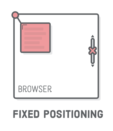
Elements with position: fixed have a lot in common with absolute positioning: the fixed positioning scheme is very manual, the element is removed from the normal flow of the page, and the coordinate system is relative to the viewport (the entire browser window). The key difference is that fixed elements don’t scroll with the rest of the page. You can still use top, right, bottom, and left properties to position it, and it will stay in place as the user scrolls.
Fixed positioning is especially useful for things like navigation bars and floating chat buttons that you ALWAYS want displayed, regardless of where the user is on your page.
Sticky Positioning
Elements with position: sticky will act like normal static elements until you scroll past them, then they start behaving like fixed elements. They are also not taken out of the normal flow of the document. It might sound confusing, so check out this sticky positioning example that might clear things up for you.
Sticky positioning is useful for things like section-headings. Remember being able to still see what category you’re looking at while scrolling through a shop? This is how it’s done!
Z-Index
We’ve never had to deal with “depth” issues before. Until now, all our HTML elements rendered above or below one another in an intuitive way. But, since we’re doing advanced stuff, relying on the browser to determine which elements appear on top of other ones isn’t going to cut it.
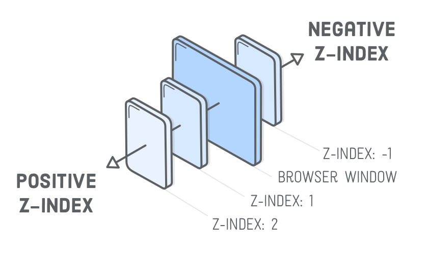
The z-index property lets you control the depth of elements on the page. If you think of your screen as 3D space, negative z-index values go farther INTO the page, and positive ones come OUT of the page. The default z-index value is 0.
.front-item {
  position: relative;
  z-index: 2;
}
.back-item {
  position: relative;
  z-index: 1;
}
Take note of that
position: relative;line. It’s required because only positioned elements pay attention to their z-index property. This is easy to forget, so make a mental note for the next time you’re having depth issues and your CSS rules don’t seem to have any effect.
Knowledge check
💬 DISCUSS: The following questions are an opportunity to reflect on key topics in this lesson. If you can’t answer a question, click on it to review the material.
Additional resources
- Web Dev Simplified’s Learn CSS Position video is fast-paced but provides a good visual representation of different positioning behaviors. Go ahead and watch it.
- MDN’s docs on
positioncovers all of the conceptual details about positioning. - CSS trick’s page Absolute, Relative, Fixed Positioning should give you a different insight on the topic. You should read it as well.
- Finally, Kevin Powell’s article discusses the difference between fixed and sticky positioning. It’s a great read to understand the difference better.
- Understand the CSS Position Property With Practical Examples provides some different CSS methods for positioning elements.
- You can check out this helpful video resource on CSS positioning from Slaying the Dragon for clear explanations and practical examples.
Acknowledgement
Content on this page is adapted from The Odin Project and most images are from Interneting is Hard.