📓3.1: Using Bootstrap Classes
Table of Contents
✴✴✴ NEW UNIT/SECTION! ✴✴✴
Create a blank website program to take your class notes in for the next few lessons.
Click on the collapsed heading below for GitHub instructions ⤵
📓 NOTES PROGRAM SETUP INSTRUCTIONS
- Go to the public template repository for our class: BWL-CS HTML/CSS/JS Template
- Click the button above the list of files then select
Create a new repository - Specify the repository name:
CS1-Unit3-Notes - For the description, write:
Responsive design with Bootstrap - Click
Now you have your own personal copy of this starter code that you can always access under the
Your repositoriessection of GitHub! 📂 - Now on your repository, click and select the
Codespacestab - Click
Create Codespace on mainand wait for the environment to load, then you’re ready to code! - 📝 Take notes in this Codespace during class, writing code & comments along with the instructor.
🛑 When class ends, don’t forget to SAVE YOUR WORK! Codespaces are TEMPORARY editing environments, so you need to COMMIT changes properly in order to update the main repository for your program.
There are multiple steps to saving in GitHub Codespaces:
- Navigate to the
Source Controlmenu on the LEFT sidebar - Click the button on the LEFT menu
- Type a brief commit message at the top of the file that opens, for example:
updated index.html - Click the small
✔️checkmark in the TOP RIGHT corner - Click the button on the LEFT menu
- Finally you can close your Codespace!
Developing Responsive Websites
🥾 Bootstrap is a popular front-end framework for developing responsive and mobile-first websites.

- Responsive
- Websites that automatically scale between devices — whether the device is a mobile phone, tablet, laptop, desktop computer, screen reader, etc.
- Mobile-First
- Websites that are primarily designed for mobile devices, then scales up from there (as opposed to being designed first for desktop, then trying to scale it down to mobile devices)
What is Bootstrap?
Bootstrap provides a collection of CSS classes and JavaScript-based design templates for layout, typography, forms, buttons, navigation, and other reusable webpage components. You are free to use whichever Bootstrap components you choose, while adding your own on top! There are thousands of websites out there that are built on Bootstrap, but with their own customizations.
Bootstrap can be used to build websites of any scale, from small blogs to large corporate websites. Organizations that use Bootstrap include NASA, FIFA, Newsweek, VOGUE and many more.
Why Use Bootstrap?
- Ease of Use: Prebuilt CSS styles and components.
- Responsiveness: Automatic adjustment to different screen sizes.
- Consistency: Uniform design across devices and browsers.
- Customizability: Override or extend styles as needed.
- Fast Development: Reusable components save time.
Installing Bootstrap 5 via CDN Link
The simplest way to load/use Bootstrap is by including its CDN link in your HTML file.
📥 A CDN (Content Delivery Network) is a distributed network of servers strategically located in different parts of the world to deliver content, such as files, images, and scripts, to users faster and more reliably.
- Include the CDN link to Bootstrap’s CSS code in the
<head>section:<!-- Bootstrap CSS --> <link href="https://cdn.jsdelivr.net/npm/bootstrap@5.3.3/dist/css/bootstrap.min.css" rel="stylesheet"> - To use interactive elements like carousels (slideshows) and modals (pop-up windows), include the CDN link to Bootstrap’s JavaScript code too:
     <!-- Bootstrap JS (optional) -->
     <script src="https://cdn.jsdelivr.net/npm/bootstrap@5.3.3/dist/js/bootstrap.bundle.min.js"></script>
Bootstrap Tutorial
🎨 Style Utilities
A major feature of using Bootstrap is that you can apply sets of pre-defined styling rules to elements directly in the HTML document, essentially adding style to your page without having to write any of your own CSS code!
Styling with Bootstrap is as simple as specifying a class name attribute in an element’s opening tag:
<h1 class="display-1 text-primary">Gallery Title</h1>
Multiple class names can be added to the same element, as long as they are separated with a SPACE. Here, the CSS rules associated with Bootstrap’s .display-1 class AND .text-primary class are both applied to the <h1> element.
💬 DISCUSS: What aspects of the heading’s style were changed by applying these two classes? What do you think the actual CSS rules (
property: value) for these classes are?
Colors
Bootstrap offers a subset of default colors, designed to convey meaning on a standard webpage:
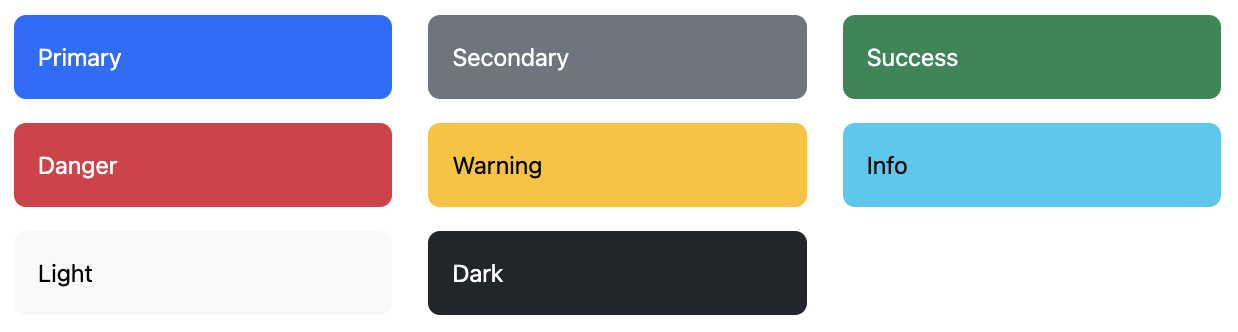
Check out some of Bootstrap’s most useful text color and background color utility classes below. This list does not contain all the possiblities, so please refer to Bootstrap’s official documentation on 📖 Colors and 📖 Background for more class names.
- Colorize text with
colorutilities:<p class="text-primary">Primary color text</p> <p class="text-secondary">Secondary color text</p> <p class="text-light">Light color text</p> <p class="text-dark">Dark color text</p>There are also emphasized versions of each Bootstrap color, just add
-emphasisto the class name. - Similar to the contextual text color classes, set the
background-colorof an element to any contextual class:<div class="bg-primary">Primary background</div> <div class="bg-secondary text-white">Secondary background with white text</div> <div class="bg-light text-dark">Light background with dark text</div> <div class="bg-dark text-light">Dark background with light text</div>There are also subtle versions of each Bootstrap color, just add
-subtleto the class name. - By adding a
.bg-gradientclass, a linear gradient is added as background image to the backgrounds:<div class="bg-secondary bg-gradient"></div>This gradient adds a semi-transparent white which fades out to the bottom.
🎨 Don’t love the Bootstrap color scheme? Here’s how to OVERRIDE the colors with your own, while keeping the same class names:
/* CSS VARIABLES let us OVERRIDE the Bootstrap color palette:
 * primary, secondary, success, danger, warning, info, light, dark
 * (need to specify our color's RGB value in both formats below)
*/
:root {
  --bs-primary: rgb(255, 0, 195) !important;
  --bs-primary-rgb: 255, 0, 195 !important;
}
Typography
Bootstrap includes many classes that define how text elements appear. Automatically, Bootstrap sets some basic 🌎 global settings for display, typography, and link styles that make HTML pages appear more modern overall.
Did you notice that Bootstrap changes the default
font-familyused?
Often, more control over specific styles is needed. Check out some of the most useful textual utility classes below. This list does not contain everything, so please refer to Bootstrap’s official documentation on 📖 Typography and 📖 Text for even more class names you can use to style text.
.leadmakes a paragraph stand out:<p class="lead"></p>.smallrepresents side-comments and small print, like copyright and legal text:<p class="small"></p>.markrepresents text which is marked or highlighted for reference or notation purposes:<span class="mark"></span>Use an inline container like
<span>around individual words or phrases to apply eye-catching styles like.mark, since typically you don’t want to highlight an entire paragraph.- Text alignment classes allow you to set the
text-alignproperty:<p class="text-start">Start aligned text.</p> <p class="text-center">Center aligned text.</p> <p class="text-end">End aligned text.</p> .fs-*allows you to modify thefont-sizeproperty quickly, to a range of different sizes. Replace the*in the class name with a number from1to6:<p class="fs-1">Largest text size.</p> <p class="fs-6">Smallest text size.</p>- Quickly change the
font-weightorfont-styleof text with these utilities.font-styleutilities are abbreviated as.fst-*andfont-weightutilities are abbreviated as.fw-*.:<p class="fw-bold">Bold text.</p> <p class="fw-semibold">Semibold weight text.</p> <p class="fw-light">Light weight text.</p> <p class="fst-italic">Italic text.</p>
📦 Containers
Containers are a fundamental building block of Bootstrap that contain, pad, and align your content within a given device or viewport. Bootstrap requires a containing element to wrap elements and contain its Grid System (more on this later on in the tutorial). Bootstrap’s container classes were created specifically for this purpose.
Bootstrap 5 includes three different container types:
- Fluid (class
.container-fluid) - Fixed (class
.container) - Responsive (see Bootstrap Documentation)
Fluid Containers
A fluid container spans the full width of the viewport. It will expand and contract fluidly as you resize the browser. This is in contrast to the fixed width container which will appear to “jump” to the new size as you pass a given break point.
<div class="container-fluid"></div>
Fixed Containers
A fixed container is a (responsive) fixed width container. As you resize your browser, its width remains intact, until it passes a certain screen size breakpoint, at which time it will resize to the new width for that break point.
<div class="container"></div>
🖼️ Responsive Images
Bootstrap provides classes that can be used when working with the <img> element. Most of these are utility classes that can be applied to any element (not just images). However, there is a class specifically for responsive images.
Bootstrap provides the .img-fluid class to make an image scale appropriately across devices. Behind the scenes, this class applies the max-width: 100% and height: auto CSS properties to the image. This ensures that the image scales to the parent element.
To see an image scale, insert an image element of your choice into a container, then try resizing your browser window:
<img src="" class="img-fluid">
Image Borders
You can use Bootstrap to render images with rounded corners or as a circle. This is acheived with the .rounded-* utility classes.
You can also use the .img-thumbnail class to give it a rounded 1 pixel border.
<img src="" class="rounded">
<img src="" class="rounded-circle">
<img src="" class="rounded-pill">
<img src="" class="img-thumbnail">
The border radius utility classes like .rounded and .rounded-circle can be applied to any element (not just images)!
Centering Images
If your <img> element is placed in a Bootstrap container or container-fluid, it will usually be centered automatically, especially if you include the class .img-fluid!
Whenever an image isn’t centering as expected, here are two solutions:
- You can include Bootstrap’s
.text-centerclass on the image’s parent element to center an image.<div class="text-center"> <img src="" class=""> </div> - Alternatively, you can force the image to “behave” like a block with Bootstrap’s class
.d-blockclass, which applies the CSS ruledisplay: block;. Then, add Bootstrap’s.mx-autoto center the block image, which setsmargin: auto;.<img src="" class="mx-auto d-block">
Borders
Check out some of Bootstrap’s most useful border and shadow utility classes below. This list does not contain all the possiblities, so please refer to Bootstrap’s official documentation on 📖 Borders and 📖 Shadows for more class names.
- Use border utilities to apply a simple
borderaround an element:<span class="border"></span>Great for images, buttons, or any other element.
- Adjust the
border-widthproperty with Bootstrap’s.border-*classes, where*can be replaced with a number between1and5:<span class="border border-1"></span> <span class="border border-5"></span>Note that you still need to include the simple
.borderclass too. - Adjust the
border-colorto use any of Bootstrap’s built-in colors:<span class="border border-primary"></span> <span class="border border-secondary"></span>There are also options for the
subtlevariation of each color, likeborder-primary-subtle. - You can also quickly add or remove a shadow on an element with
box-shadowutility classes:<div class="shadow-sm">Small shadow</div> <div class="shadow">Regular shadow</div> <div class="shadow-lg">Larger shadow</div>
🔲 Grid System Layouts
Bootstrap’s grid system uses a series of container ➡️ row ➡️ column nested structures to layout and align content. It’s built with CSS flexbox and is fully responsive.
The Bootstrap grid system separates a page’s width into up to 12 columns, and you can specify how many columns a column should take up in a row:
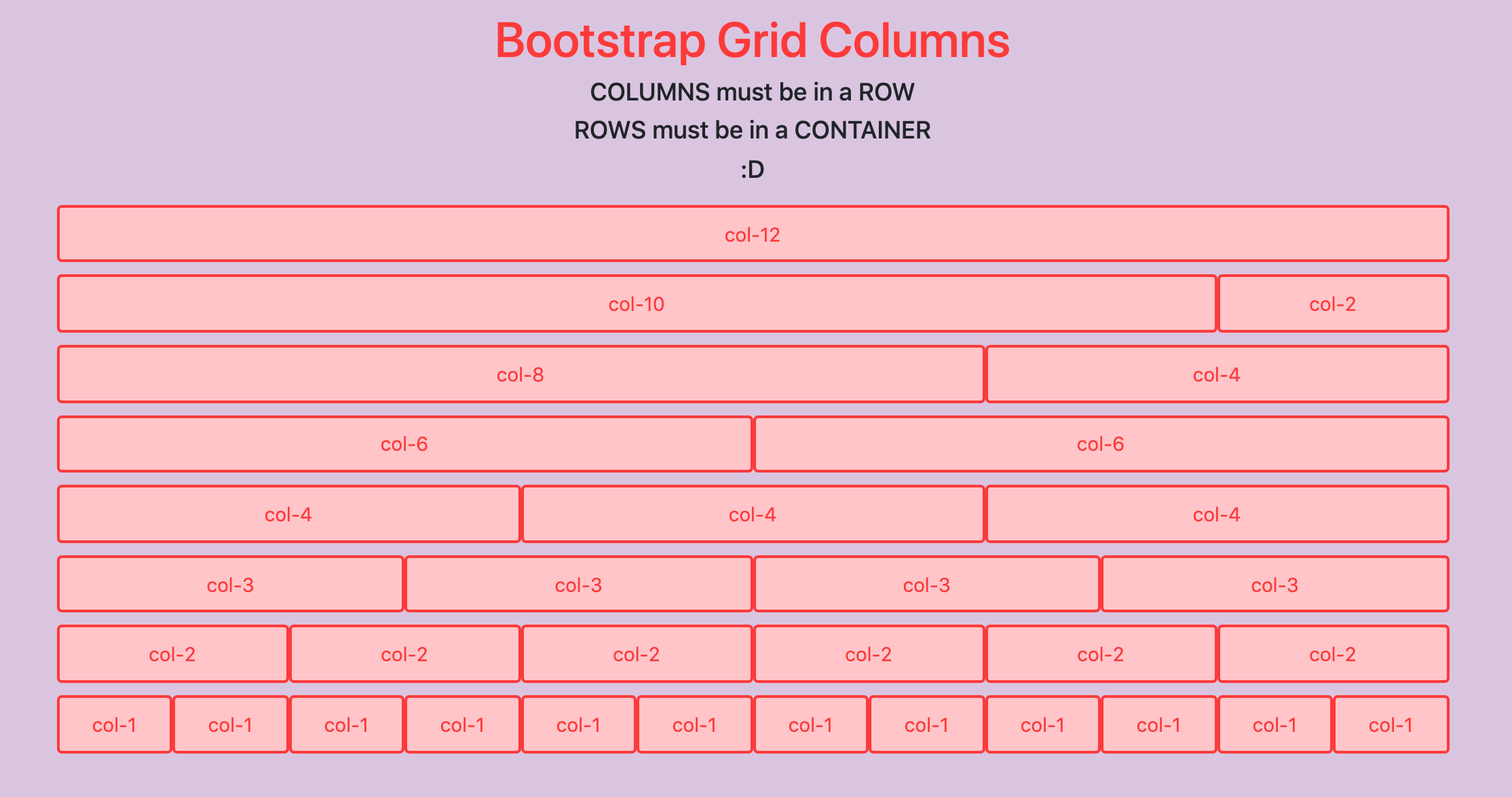
For grids that are the same from the smallest of devices to the largest, use the .col class for equal-width columns, or the .col-* classes (replace the * in the class name with a number between 1 and 12).
- Specify a numbered class when you need a specific-sized column:
<div class="container"> <div class="row"> <div class="col-8"></div> <div class="col-4"></div> </div> </div> - Otherwise, feel free to stick to
.colfor equal-width columns:<div class="container"> <div class="row"> <div class="col"></div> <div class="col"></div> <div class="col"></div> <div class="col"></div> </div> </div>
Customized Breakpoints
You can further customize how columns scale for different viewport sizes at different breakpoints. This is a complex topic, so please refer to Bootstrap’s official documentation on 📖 Grid Options.
To demonstrate Bootstrap’s grid structure classes, go to the “Grid Gallery” activity on our course website: 🎯 Unit 3 Activities
Acknowledgement
Content on this page is adapted from Bootstrap 5 Tutorial - Quackit and the Bootstrap Documentation.