📓1.3: CSS Foundations
Table of Contents
Introduction to CSS
In the previous topic, you learned how to write the HTML that determines how a web page is structured. The next step is to make that structure look good with some style, which is exactly what CSS is for. In the next few lessons, we’re going to focus on what we believe are some foundational CSS concepts, things that everyone should know from the beginning — whether they are just starting out or need a refresher.
General overview of topics that you will learn in this module:
- Add styles to HTML with CSS.
- Understand how to use the class and ID attributes.
- Add styles to specific elements using the correct selectors.
Basic Syntax
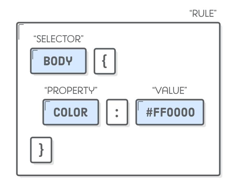
At the most basic level, CSS is made up of various rules. These rules are made up of a selector (more on this in a bit) and a semicolon-separated list of declarations, with each of those declarations being made up of a property–value pair.
A
<div>is one of the basic HTML elements. It is an empty container. In general, it is best to use content-specific tags such as<h1>or<p>for content in your projects, but as we learn more about CSS you’ll find that there are many cases where the thing you need is just a blank container to group other elements. Many of our exercises use plain<div>s for simplicity. Later lessons will go into much more depth about when it is appropriate to use the various HTML elements.
CSS Selectors
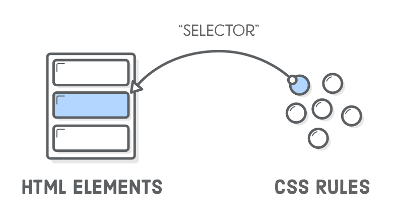
👉 Selectors refer to the HTML elements on which a set of CSS rules apply; they determine which part of the webpage is actually being “selected” for each rule.
The following subsections don’t cover every selector available, but they’re by far the most common and the ones you should get comfortable using first.
Universal Selector
The universal selector will select ALL elements of any type, hence the name “universal”, and the syntax for it is a simple asterisk. In the example below, every element would have the color: purple; style applied to it.
* {
  color: purple;
}
Type Selectors
A type selector (or element selector) will select all elements of the given element type, and the syntax is just the name of the element:
<!-- index.html -->

<div>Hello, World!</div>
<div>Hello again!</div>
<p>Hi...</p>
<div>Okay, bye.</div>
/* styles.css */

div {
  color: hotpink;
}
Here, all three <div> elements would be selected, while the <p> element wouldn’t be.
Class Selectors
Class selectors will select all elements with the given class, which is just an attribute you place on an HTML element.
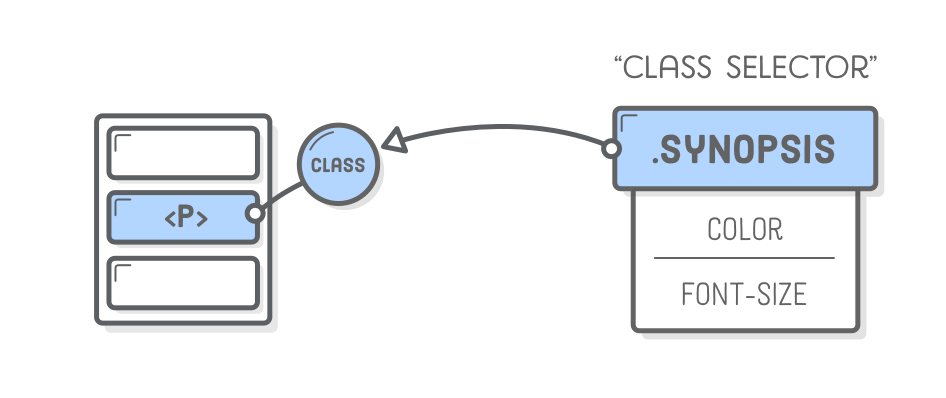
Here’s how you add a class to an HTML tag and select it in CSS:
<!-- index.html -->

<div class="alert-text">Please agree to our terms of service.</div>
/* styles.css */

.alert-text {
  color: red;
}
Note the syntax for class selectors: a period . immediately followed by the case-sensitive value of the class attribute. Classes aren’t required to be specific to a particular element, so you can use the same class on as many elements as you want.
Another thing you can do with the class attribute is to add multiple classes to a single element as a space-separated list, such as class="alert-text severe-alert". Since whitespace is used to separate class names like this, you should never use spaces for multi-worded names and should use a hyphen instead.
ID Selectors
ID selectors are similar to class selectors. They select an element with the given id, which is another attribute you can place on an HTML element.
The major difference between classes and IDs is that an element can only have one ID. It cannot be repeated on a single page, and should not contain any whitespace (use dashes - if you need multiple words!)
<!-- index.html -->

<div id="title">My Awesome 90's Page</div>
/* styles.css */

#title {
  background-color: red;
}
For IDs, instead of a period, we use a hashtag (#) immediately followed by the case-sensitive value of the ID attribute.
A common pitfall is people overusing the ID attribute when they don’t necessarily need to, and when classes will suffice. While there are cases where using an ID makes sense or is needed, such as taking advantage of specificity or having links redirect to a section on the current page, you should use IDs sparingly.
Advanced Selection
Grouping Selector
What if we have two groups of elements that share some of their style declarations?
.read {
  color: white;
  background-color: black;
  /* several unique declarations */
}

.unread {
  color: white;
  background-color: black;
  /* several unique declarations */
}
Both our .read and .unread selectors share the color: white; and background-color: black; declarations, but otherwise have several of their own unique declarations. To cut down on the repetition, we can group these two selectors together as a comma-separated list:
.read,
.unread {
  color: white;
  background-color: black;
}

.read {
  /* several unique declarations */
}

.unread {
  /* several unique declarations */
}
Both of the examples above (with and without grouping) will have the same result, but the second example reduces the repetition of declarations and makes it easier to edit either the color or background-color for both classes at once.
Chaining Selectors
Another way to use selectors is to chain them as a list without any separation. Let’s say we had the following HTML:
<div>
  <div class="subsection header">Latest Posts</div>
  <p class="subsection preview">This is where a preview for a post might go.</p>
</div>
We have two elements with the subsection class that have some sort of unique styles, but what if we only want to apply a separate rule to the element that also has header as a second class? Well, we could chain both the class selectors together in our CSS like so:
.subsection.header {
  color: red;
}
What .subsection.header does is it selects any element that has both the subsection and header classes. Notice how there isn’t any space between the .subsection and .header class selectors. This syntax basically works for chaining any combination of selectors, except for chaining more than one type selector.
This can also be used to chain a class and an ID, as shown below:
<div>
  <div class="subsection header">Latest Posts</div>
  <p class="subsection" id="preview">
    This is where a preview for a post might go.
  </p>
</div>
You can take the two elements above and combine them with the following:
.subsection.header {
  color: red;
}

.subsection#preview {
  color: blue;
}
In general, you can’t chain more than one type selector since an element can’t be two different types at once. For example, chaining two type selectors like
divandpwould give us the selectordivp, which wouldn’t work since the selector would try to find a literal<divp>element, which doesn’t exist.
Descendant Combinator
Combinators allow us to combine multiple selectors differently than either grouping or chaining them, as they show a relationship between the selectors. There are four types of combinators in total, but for right now we’re going to only show you the descendant combinator, which is represented in CSS by a single space between selectors. A descendant combinator will only cause elements that match the last selector to be selected if they also have an ancestor (parent, grandparent, etc.) that matches the previous selector.
So something like .ancestor .child would select an element with the class child if it has an ancestor with the class ancestor. Another way to think of it is that child will only be selected if it is nested inside ancestor, regardless of how deep that nesting is. Take a quick look at the example below and see if you can tell which elements would be selected based on the CSS rule provided:
<!-- index.html -->

<div class="ancestor">
  <!-- A -->
  <div class="contents">
    <!-- B -->
    <div class="contents"><!-- C --></div>
  </div>
</div>

<div class="contents"><!-- D --></div>
/* styles.css */

.ancestor .contents {
  /* some declarations */
}
In the above example, the first two elements with the contents class (B and C) would be selected, but that last element (D) wouldn’t be. Was your guess correct?
There’s really no limit to how many combinators you can add to a rule, so .one .two .three .four would be totally valid. This would just select an element that has a class of four if it has an ancestor with a class of three, and if that ancestor has its own ancestor with a class of two, and so on. You generally want to avoid trying to select elements that need this level of nesting, though, as it can get pretty confusing and long, and it can cause issues when it comes to specificity.
Specificity
A CSS declaration that is more specific will take precedence over less specific ones. Inline styles, which we went over in the previous lesson, have the highest specificity compared to selectors, while each type of selector has its own specificity level that contributes to how specific a declaration is. Other selectors contribute to specificity, but we’re focusing only on the ones we’ve gone over so far:
- ID selectors (most specific)
- Class selectors
- Type selectors
Specificity will only be taken into account when an element has multiple, conflicting declarations targeting it, sort of like a tie-breaker.
🎲 Play the CSS Diner game to practice selectors.
CSS Properties
There are some CSS properties that you’re going to be using all the time, or at the very least more often than not. We’re going to introduce you to several of these properties, though this is by no means a complete list. Learning the following properties will be enough to help get you started.
🎨 Text Color and Background Color
The color property sets an element’s text color, while background-color sets, well, the background color of an element. I guess we’re done here?
Almost. Both of these properties can accept one of several kinds of values. A common one is a keyword, such as an actual color name like red or the transparent keyword. They also accept HEX, RGB, and HSL values, which you may be familiar with if you’ve ever used a photoshop program or a site where you could customize your profile colors.
p {
  /* hex example: */
  color: #1100ff;
}

p {
  /* rgb example: */
  color: rgb(100, 0, 127);
}

p {
  /* hsl example: */
  color: hsl(15, 82%, 56%);
}
Take a quick look at CSS Legal Color Values to see how you can adjust the opacity of these colors by adding an alpha value.
🔤 Typography
font-familycan be a single value or a comma-separated list of values that determine what font an element uses. Each font will fall into one of two categories, either a “font family name” like"Times New Roman"(we use quotes due to the whitespace between words) or a “generic family name” likeserif(generic family names never need quotes).If a browser cannot find or does not support the first font in a list, it will use the next one, then the next one and so on until it finds a supported and valid font. This is why it’s best practice to include a list of values for this property, starting with the font you want to be used most and ending with a generic font family as a fallback, e.g.
font-family: "Times New Roman", serif;-
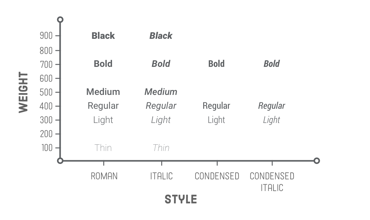
font-sizewill, as the property name suggests, set the size of the font. When giving a value to this property, the value should not contain any whitespace, e.g.font-size: 22pxhas no space between “22” and “px”. font-weightaffects the boldness of text, assuming the font supports the specified weight. This value can be a keyword, e.g.font-weight: bold, or a number between 1 and 1000, e.g.font-weight: 700(the equivalent ofbold).Usually, the numeric values will be in increments of 100 up to 900, though this will depend on the font.
text-alignwill align text horizontally within an element, and you can use the common keywords you may have come across in word processors as the value for this property, e.g.text-align: center.
📐 Height and Width
Images aren’t the only elements that we can adjust the height and width on, but we want to focus on them specifically in this case.
By default, an <img> element’s height and width values will be the same as the actual image file’s height and width.
Maintaining Aspect Ratio: If you wanted to adjust the size of the image without causing it to lose its proportions, you would use a value of “auto” for the height property and adjust the width value.
img {
  height: auto;
  width: 500px;
}
For example, if an image’s original size was 500px height and 1000px width, using the above CSS would result in a height of 250px. These properties work in conjunction with the height and width attributes in the HTML.
Adding CSS to HTML
Now that we’ve learned some basic syntax, you might be wondering how to add all this CSS to our HTML. There are three methods to do so.
External CSS
External CSS is the most common method you will come across, and it involves creating a separate file for the CSS and linking it inside of an HTML’s opening and closing <head> tags with a void <link> element:
<!-- index.html -->

<head>
  <link rel="stylesheet" href="styles.css">
</head>
/* styles.css */

div {
  color: white;
  background-color: black;
}
First, we add a void <link> element inside of the opening and closing <head> tags of the HTML file.
The
hrefattribute is the location of the CSS file, either an absolute URL or, what you’ll be utilizing, a URL relative to the location of the HTML file. In our example above, we are assuming both files are located in the same directory. Therelattribute is required, and it specifies the relationship between the HTML file and the linked file.
Then inside of the newly created styles.css file, we have the selector (the div), followed by a pair of opening and closing curly braces, which create a “declaration block”. Finally, we place any declarations inside of the declaration block. color: white; is one declaration, with color being the property and white being the value, and background-color: black; is another declaration.
A note on file names: styles.css is just what we went with as the file name here. You can name the file whatever you want as long as the file type is .css, though “style” or “styles” is most commonly used.
A couple of the pros to this method are:
- It keeps our HTML and CSS separated, which results in the HTML file being smaller and making things look cleaner.
- We only need to edit the CSS in one place, which is especially handy for websites with many pages that all share similar styles.
Internal CSS
Internal CSS (or embedded CSS) involves adding the CSS within the HTML file itself, instead of creating a completely separate file. With the internal method, you place all the rules inside of a pair of opening and closing <style> tags, which are then placed inside of the opening and closing <head> tags of your HTML file. Since the styles are being placed directly inside of the <head> tags, we no longer need a <link> element that the external method requires.
Besides these differences, the syntax is exactly the same as the external method (selector, curly braces, declarations):
<head>
  <style>
    div {
      color: white;
      background-color: black;
    }
  </style>
</head>
<body>
  ...
</body>
This method can be useful for adding unique styles to a single page of a website, but it doesn’t keep things separate like the external method, and depending on how many rules and declarations there are it can cause the HTML file to get pretty big.
Inline CSS
Inline CSS makes it possible to add styles directly to HTML elements, though this method isn’t as recommended:
<body>
  <div style="color: white; background-color: black;">...</div>
</body>
The first thing to note is that we don’t actually use any selectors here, since the styles are being added directly to the opening <div> tag itself. Next, we have the style= attribute, with its value within the pair of quotation marks being the declarations.
If you need to add a unique style for a single element, this method can work just fine. Generally, though, this isn’t exactly a recommended way for adding CSS to HTML for a few reasons:
- It can quickly become pretty messy once you start adding a lot of declarations to a single element, causing your HTML file to become unnecessarily bloated.
- If you want many elements to have the same style, you would have to copy and paste the same style to each individual element, causing lots of unnecessary repetition and more bloat.
- Any inline CSS will override the other two methods, which can cause unexpected results. (While we won’t dive into it here, this can actually be taken advantage of.)
Additional resources
- The CSS Cascade is a great, interactive read that goes a little more in detail about other factors that affect what CSS rules actually end up being applied.
- Mozilla CSS Properties Reference can be used to learn if a particular CSS property is inherited or not; look for the Inherited field inside the Formal Definition section. Here’s an example for the CSS
colorproperty.
The Box Model
Now that you understand the basic syntax of HTML and CSS, we’re going to get serious. The most important skills you need to master with CSS are positioning and layout. Changing fonts and colors is a crucial skill, but being able to put things exactly where you want them on a webpage is even more crucial. After all, how many webpages can you find where absolutely every element is just stacked one on top of another?
Learning to position elements on a webpage is not that difficult once you understand just a few key concepts. Unfortunately, many learners race through learning HTML and CSS to get to JavaScript and end up missing these fundamental concepts. This leads to frustration and pain (and memes) because all the JavaScript skills in the world are meaningless if you can’t stick your elements on the page where you need them to be. So with that in mind, let’s get started.
- You’ll learn all about the box model.
- You’ll learn how to make sure elements are just the right size with
margin,padding, andborders.
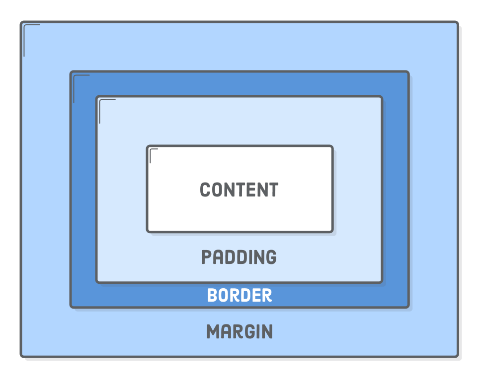
paddingincreases the space between the border of a box and the content of the box.borderadds space (even if it’s only a pixel or two) between the margin and the padding.marginincreases the space between the borders of a box and the borders of adjacent boxes.
The Box Model
The first important concept that you need to understand to be successful in CSS is the box model. It isn’t complicated, but skipping over it now would cause you much frustration down the line.
🔲 Every single thing on a webpage is a rectangular box. These boxes can have other boxes in them and can sit alongside one another. You can get a rough idea of how this works by applying an outline to every element, using the universal selector * on the page like this:
* {
  border: 2px solid red;
}
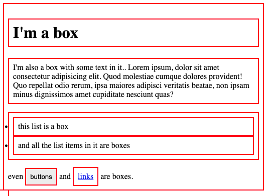
You can use the browser’s inspector to add the CSS above to this web page if you want, by clicking the + button in the top right of the “Styles” panel within the “Elements” tab. Boxes in boxes!
OK, so there might be some circles in the above image… but when it comes to layout, they fit together like rectangular boxes and not circles. In the end, laying out a webpage and positioning all its elements is deciding how you are going to nest and stack these boxes.
- Learn CSS Box Model In 8 Minutes is a straightforward overview of the box model, padding and margin. Go ahead and watch this now; it informs everything else.
- box-sizing: border-box (EASY!) is an add-on to the above resource with a better explanation of ‘box-sizing’.
- Because the box model concept is so incredibly fundamental, let’s dig a bit deeper with MDN’s lesson on the box model. It covers the same material as the video(s) above and will introduce you to inline boxes that we will explore in the next lesson. Pay close attention to the examples and take the time to experiment with their in-browser editor!
- The CSS Tricks page on margins has some further information about the
marginproperty that you’ll find useful. Specifically, the sections aboutautoand margin collapsing contain things you’ll want to know.
Knowledge check
The following questions are an opportunity to reflect on key topics in this lesson. If you can’t answer a question, click on it to review the material, but keep in mind you are not expected to memorize or master this knowledge.
- From inside to outside, what is the order of box-model properties?
- What does the
box-sizingCSS property do? - What is the difference between the standard and alternative box model?
- Would you use
marginorpaddingto create more space between 2 elements? - Would you use
marginorpaddingto create more space between the contents of an element and its border? - Would you use
marginorpaddingif you wanted two elements to overlap each other? - How do you set the alternative box model for all of your elements?
- How do you center an element horizontally?
Block and Inline
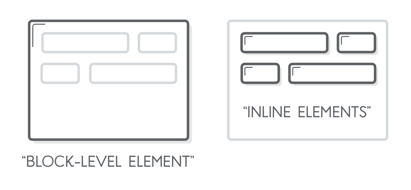
In the previous lesson, we discovered that different display types have unique box models, and we can modify the box calculation by changing the display property. CSS has two box types: block and inline boxes, which determine element behavior and interaction. The display property controls how HTML elements appear on the webpage. We will explore its various options further in this lesson.
- You’ll learn about “Normal flow”.
- You’ll learn the difference between
blockandinlineelements. - You’ll learn which elements default to
blockand which elements default toinline. - You’ll learn what divs and spans are.
Block vs inline
Most of the elements that you have learned about so far are block elements. In other words, their default style is display: block. By default, block elements will appear on the page stacked atop each other, each new element starting on a new line.
Inline elements, however, do not start on a new line. They appear in line with whatever elements they are placed beside. A clear example of an inline element is a link, or <a> tag. If you stick one of these in the middle of a paragraph of text, the link will behave like a part of the paragraph. Additionally, padding and margin behave differently on inline elements. In general, you do not want to try to put extra padding or margin on inline elements.
Div and Span Elements
We can’t talk about block and inline elements without discussing divs and spans. All the other HTML elements we have encountered so far give meaning to their content. For example, paragraph elements tell the browser to display the text it contains as a paragraph. Strong elements tell the browser which texts within are important and so on. Yet, divs and spans give no particular meaning to their content. They are just generic boxes that can contain anything.
Having elements like this available to us is a lot more useful than it may first appear. We will often need elements that serve no other purpose than to be “hook” elements. We can give an id or class to target them for styling with CSS. Another use case we will face regularly is grouping related elements under one parent element to correctly position them on the page. Divs and spans provide us with the ability to do this.
div is a block-level element by default. It is commonly used as a container element to group other elements. Divs allow us to divide the page into different blocks and apply styling to those blocks.
See the Pen block-inline-lesson-div-example by TheOdinProject (@TheOdinProjectExamples) on CodePen.
span is an inline-level element by default. It can be used to group text content and inline HTML elements for styling and should only be used when no other semantic HTML element is appropriate.
See the Pen Untitled by TheOdinProject (@TheOdinProjectExamples) on CodePen.
Additional Resources
- The concept of “Normal flow” is implied in the box-model resources, but isn’t laid out very specifically. Read “Normal Flow” from MDN to make sure you understand how elements lay themselves out by default.
- W3 schools’ “HTML Block and Inline Elements” has a description and a list of all the default block and inline elements.
- The Digital Ocean tutorial “Inline vs Inline-block Display in CSS” has a couple of great examples that clarify the difference between
inlineandinline-block.
Acknowledgement
Content on this page is adapted from The Odin Project and most images are from Interneting is Hard.