📓1.4: Flexbox
Table of Contents
Flexbox Layouts
As you’ll learn, there are many ways to move elements around on a web page. New methods have been developed over the years and older things have fallen out of style. Flexbox was not always available in CSS - its debut was revolutionary. Learn more about the history of flexbox.
Many resources put it near the end of their curriculum because it is somewhat new as a technology. But at this point, it has become the default way of positioning elements for many developers. Flexbox will be one of the most used tools in your toolbox, so why not learn it first?
- You will learn how to position elements using flexbox.
- You will learn about flex containers and flex items.
- You will learn how to create useful components and layouts that go beyond just stacking and centering items.
Before we get started
Flexbox layouts can get a little complicated. In a previous lesson, you learned how to inspect and debug things using your browser’s developer tools. Those tools will be crucial for you in the following lessons. If something isn’t behaving the way you expect, inspecting it in the developer tools should be your first step every time.
Flexbox isn’t necessarily any more difficult than the other concepts that we’ve covered so far, but it does have a few more moving parts. It is going to be somewhat difficult to make use of any of the things you’re learning in these first lessons until you get to the end and can put it all together. As we go, do yourself a favor and play with all of the code examples.
You will almost definitely need to come back and reference these lessons (or a couple of the resources we share with you) when you get to the assignments at the end of the section, but if you take your time and experiment with all the code examples we provide, you’ll know better where to look when that time comes.
Let’s flex!
Flexbox is a way to arrange items into rows or columns. These items will flex (i.e. grow or shrink) based on some rules that you can define. To get started, let’s look at a demonstration.
We’ve embedded a lot of interactive examples in these lessons. Take your time to experiment with them as you go to cement the concepts in your mind!
See the Pen first flex example by TheOdinProject (@TheOdinProjectExamples) on CodePen.
We’ll get into exactly what’s going on here soon enough. But for now, let’s uncomment the two flex related CSS declarations in the above Codepen by removing the /* and */ tags surrounding them, then check out the result.
Comments prevent the browser from interpreting lines as code, and are wrapped between specific tags. CSS uses /*as an opening comment tag and */ as a closing comment tag, while HTML and JavaScript have their own syntax. Commented out lines of code can be ‘re-enabled’ by removing the comment tags surrounding the code.
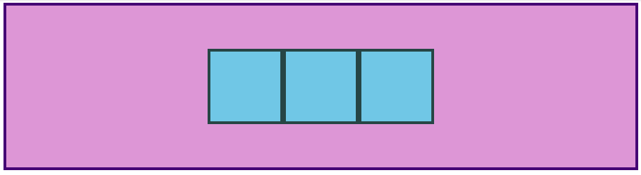
All 3 divs should now be arranged horizontally. If you resize the results frame with the “1x”, “.5x” and “.25x” buttons you’ll also see that the divs will ‘flex’. They will fill the available area and will each have equal width.
If you add another div to the HTML, inside of .flex-container, it will show up alongside the others, and everything will flex to fit within the available area.
If it’s hard to see what’s going on in the small embedded CodePen, feel free to click the “Edit on CodePen” or “Fork on CodePen” button. This will bring the example into a full-sized environment. Some of the later examples might especially benefit from doing this.
Flex containers and flex items
As you’ve seen, flexbox is not just a single CSS property but a whole toolbox of properties that you can use to put things where you need them. Some of these properties belong on the flex container, while some go on the flex items. This is an important concept.
A flex container is any element that has display: flex on it. A flex item is any element that lives directly inside of a flex container.
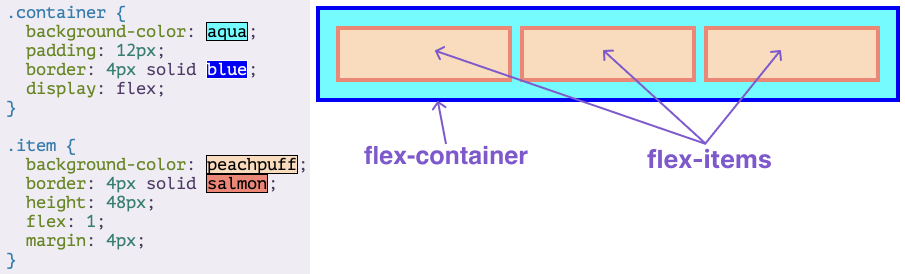
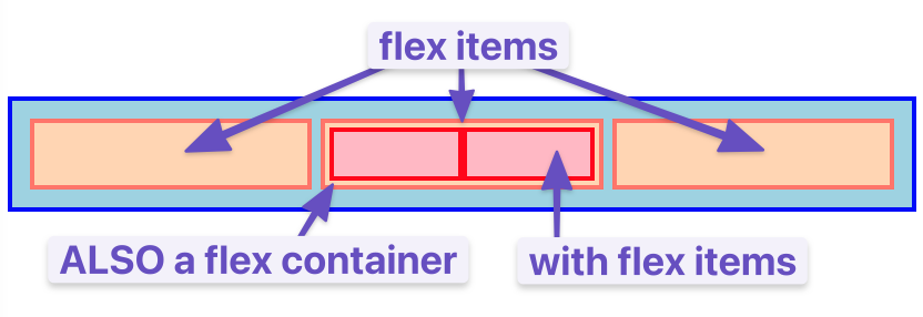
Somewhat confusingly, any element can be both a flex container and a flex item. Said another way, you can also put display: flex on a flex item and then use flexbox to arrange its children.
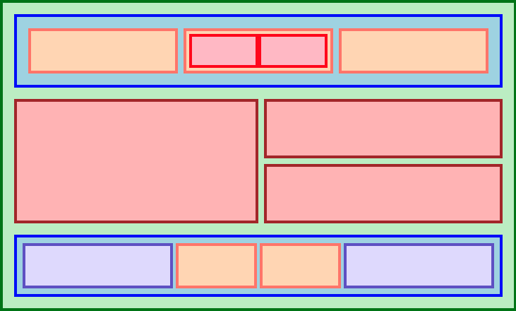
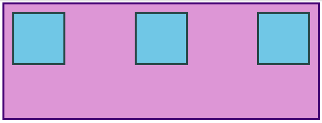
Creating and nesting multiple flex containers and items is the primary way we will be building up complex layouts. The following image was achieved using only flexbox to arrange, size, and place the various elements. Flexbox is a very powerful tool.
Additional resources
This section contains helpful links to related content. It isn’t required, so consider it supplemental.
- Interneting Is Hard has a tutorial on modern CSS layouts with flexbox.
- Slaying the dragon tutorial on Flexbox in 8 minutes.
Growing & Shrinking
The flex shorthand
The flex declaration is actually a shorthand for 3 properties that you can set on a flex item. These properties affect how flex items size themselves within their container. You’ve seen some shorthand properties before, but we haven’t officially defined them yet.
Shorthand properties are CSS properties that let you set the values of multiple other CSS properties simultaneously. Using a shorthand property, you can write more concise (and often more readable) stylesheets, saving time and energy.
Source: Shorthand properties on MDN
In this case, flex is actually a shorthand for flex-grow, flex-shrink and flex-basis.
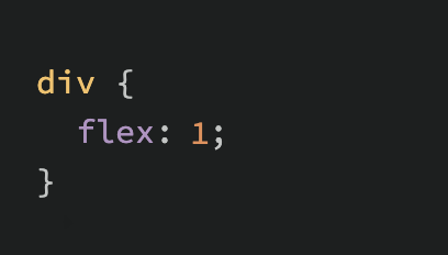
In the above screenshot, flex: 1 equates to: flex-grow: 1, flex-shrink: 1, flex-basis: 0.
Very often you see the flex shorthand defined with only one value. In that case, that value is applied to flex-grow. So when we put flex: 1 on our divs, we were actually specifying a shorthand of flex: 1 1 0.
Flex-grow
flex-grow expects a single number as its value, and that number is used as the flex-item’s “growth factor”. When we applied flex: 1 to every div inside our container, we were telling every div to grow the same amount. The result of this is that every div ends up the exact same size. If we instead add flex: 2 to just one of the divs, then that div would grow to 2x the size of the others.
In the following example the flex shorthand has values for flex-shrink and flex-basis specified with their default values.
See the Pen flex-grow example by TheOdinProject (@TheOdinProjectExamples) on CodePen.
Flex-shrink
flex-shrink is similar to flex-grow, but sets the “shrink factor” of a flex item. flex-shrink only ends up being applied if the size of all flex items is larger than their parent container. For example, if our 3 divs from above had a width declaration like: width: 100px, and .flex-container was smaller than 300px, our divs would have to shrink to fit.
The default shrink factor is flex-shrink: 1, which means all items will shrink evenly. If you do not want an item to shrink then you can specify flex-shrink: 0;. You can also specify higher numbers to make certain items shrink at a higher rate than normal.
Here’s an example. Note that we’ve also changed the flex-basis for reasons that will be explained shortly. If you shrink your browser window you’ll notice that .two never gets smaller than the given width of 250px, even though the flex-grow rule would otherwise specify that each element should be equally sized.
See the Pen flex-shrink example by TheOdinProject (@TheOdinProjectExamples) on CodePen.
An important implication to notice here is that when you specify flex-grow or flex-shrink, flex items do not necessarily respect your given values for width. In the above example, all 3 divs are given a width of 250px, but when their parent is big enough, they grow to fill it. Likewise, when the parent is too small, the default behavior is for them to shrink to fit. This is not a bug, but it could be confusing behavior if you aren’t expecting it.
Flex-basis
flex-basis sets the initial size of a flex item, so any sort of flex-growing or flex-shrinking starts from that baseline size. The shorthand value defaults to flex-basis: 0%. The reason we had to change it to auto in the flex-shrink example is that with the basis set to 0, those items would ignore the item’s width, and everything would shrink evenly. Using auto as a flex-basis tells the item to check for a width declaration (width: 250px).
Important note about flex-basis
There is a difference between the default value of flex-basis and the way the flex shorthand defines it if no flex-basis is given. The actual default value for flex-basis is auto, but when you specify flex: 1 on an element, it interprets that as flex: 1 1 0. If you want to only adjust an item’s flex-grow you can do so directly, without the shorthand. Or you can be more verbose and use the full 3 value shorthand flex: 1 1 auto, which is also equivalent to using flex: auto.
What is flex auto?
If you noticed, we mentioned a new flex shorthand flex: auto in the previous note. However we didn’t fully introduce it. flex: auto is one of the shorthands of flex. When auto is defined as a flex keyword it is equivalent to the values of flex-grow: 1, flex-shrink: 1 and flex-basis: auto or to flex: 1 1 auto using the flex shorthand. Note that flex: auto is not the default value when using the flex shorthand despite the name being “auto” which may be slightly confusing at first. You will encounter and learn more about flex: auto and its potential use-cases when reading through the assignment section.
In practice
In practice you will likely not be using complex values for flex-grow, flex-shrink or flex-basis. Generally, you’re most likely to use declarations like flex: 1; to make divs grow evenly and flex-shrink: 0 to keep certain divs from shrinking.
It is possible to get fancy, and set up layouts where some columns relate to each other in a specific ratio, so it’s useful to know that you can use other values, but those are relatively rare.
- Read W3C’s flex section to understand the basic values of common flex shorthand values.
- MDN’s documentation on flex summarizes the entire flex shorthand values, as well as introduces some new syntax that hasn’t been covered in the previous article.
Additional resources
This section contains helpful links to related content. It isn’t required, so consider it supplemental.
Flexbox Axes
Let’s see how the orientation of items within a flex container can be controlled using the flex-direction property.
- You’ll learn about the 2 “axes” of a flex container.
- You’ll learn how to change those axes to arrange your content in columns instead of rows.
Axes
The most confusing thing about flexbox is that it can work either horizontally or vertically, and some rules change a bit depending on which direction you are working with. The default direction for a flex container is horizontal, or row, but you can change the direction to vertical, or column. The direction can be specified in CSS like so:
.flex-container {
  flex-direction: column;
}
No matter which direction you’re using, you need to think of your flex-containers as having 2 axes: the main axis and the cross axis. It is the direction of these axes that changes when the flex-direction is changed. In most circumstances, flex-direction: row puts the main axis horizontal (left-to-right), and column puts the main axis vertical (top-to-bottom).
In other words, in our very first example, we put display: flex on a div and it arranged its children horizontally. This is a demonstration of flex-direction: row, the default setting. The following example is very similar. If you uncomment the line that says flex-direction: column, those divs will stack vertically.
See the Pen flex-direction example by TheOdinProject (@TheOdinProjectExamples) on CodePen.
One thing to note is that in this example, flex-direction: column would not work as expected if we used the shorthand flex: 1. Try it out now (i.e. go change the flex value on the flex: 1 1 auto; line). Can you figure out why it does not work if flex: 1 is used? The divs collapse, even though they clearly have a height defined there.
The reason for this is that the flex shorthand expands flex-basis to 0, which means that all flex-growing and flex-shrinking would begin their calculations from 0. Empty divs by default have 0 height, so for our flex items to fill up the height of their container, they don’t actually need to have any height at all.
The example above fixed this by specifying flex: 1 1 auto, telling the flex items to default to their given height. We could also have fixed it by putting a height on the parent .flex-container, or by using flex-grow: 1 instead of the shorthand.
Another detail to notice: when we changed the flex-direction to column, flex-basis refers to height instead of width. Given the context this may be obvious, but it’s something to be aware of.
We’ve strayed from the point slightly… We were talking about flex-direction and axes. To bring it back home, the default behavior is flex-direction: row which arranges things horizontally. The reason this often works well without changing other details in the CSS is because block-level elements default to the full width of their parent. Changing things to vertical using flex-direction: column adds complexity because block-level elements default to the height of their content, and in this case there is no content.
There are situations where the behavior of flex-direction could change if you are using a language that is written top-to-bottom or right-to-left, but you should save worrying about that until you are ready to start making a website in Arabic or Hebrew.
Flexbox Alignment
So far everything we’ve touched with flexbox has used the rule flex: 1 on all flex items, which makes the items grow or shrink equally to fill all of the available space. Very often, however, this is not the desired effect. Flex is also very useful for arranging items that have a specific size.
- You’ll learn how to align items inside a flex container both vertically and horizontally.
Alignment
Let’s look at an example.
See the Pen flex-alignment example by TheOdinProject (@TheOdinProjectExamples) on CodePen.
You should be able to predict what happens if you put flex: 1 on the .item by now. Give it a shot before we move on!
Adding flex: 1 to .item makes each of the items grow to fill the available space, but what if we wanted them to stay the same width, but distribute themselves differently inside the container? We can do this!
Remove flex: 1 from .item and add justify-content: space-between to .container. Doing so should give you something like this:
justify-content aligns items across the main axis. There are a few values that you can use here. You’ll learn the rest of them in the reading assignments, but for now try changing it to center, which should center the boxes along the main axis.
To change the placement of items along the cross axis use align-items. Try getting the boxes to the center of the container by adding align-items: center to .container. The desired result looks like this:
Because justify-content and align-items are based on the main and cross axis of your container, their behavior changes when you change the flex-direction of a flex-container. For example, when you change flex-direction to column, justify-content aligns vertically and align-items aligns horizontally. The most common behavior, however, is the default, i.e. justify-content aligns items horizontally (because the main axis defaults to horizontal), and align-items aligns them vertically. One of the biggest sticking points that beginners have with flexbox is confusion when this behavior changes.
Gap
One very useful feature of flex is the gap property. Setting gap on a flex container adds a specified space between flex items, similar to adding a margin to the items themselves. gap is a new property so it doesn’t show up in many resources yet, but it works reliably in all modern browsers, so it is safe to use and very handy! Adding gap: 8px to the centered example above produces the result below.
See the Pen flex-alignment example by TheOdinProject (@TheOdinProjectExamples) on CodePen.
There’s more for you to learn in the reading below, but at this point you can surely see how immensely useful flexbox is. With just the properties we’ve already covered, you could already put together some impressive layouts!
Take your time going through the reading. There will be some review of the items we’ve already covered here, but it goes into more depth and touches on a few things that haven’t been mentioned yet. Don’t stress too much about trying to memorize every little detail yet; just code along with the examples and do your best to internalize everything that is possible with flexbox. You’ll have to reach for these resources again once you get to the practice exercises, but that’s perfectly acceptable. The more you use this stuff the better it will stick in your mind… and you will be using it constantly. Have fun!
- This beautiful Interactive Guide to Flexbox covers everything you need to know. It will help reinforce concepts we’ve already touched on with some really fun and creative examples. Spend some time here, some of it should be review at this point, but the foundations here are important!
- Typical use cases of Flexbox is an MDN article that covers some more practical tips. Don’t skip the interactive sections! Playing around with this stuff is how you learn it!
- The CSS Tricks “Guide to Flexbox” is a classic. The images and examples are super helpful. It would be a good idea to review parts 1-3 and part 5 (don’t worry about the media query parts, we will cover them later in the course) and then bookmark it as a great cheat sheet for future reference (keep it handy for the practice exercises).
- Go back to our CSS exercises repository and navigate to the
flexdirectory. Review each README file prior to completing the following exercises in order:01-flex-center02-flex-header03-flex-header-204-flex-information05-flex-modal06-flex-layout07-flex-layout-2
Note: Solutions for these exercises can be found in the
solutionfolder of each exercise.
Knowledge check
The following questions are an opportunity to reflect on key topics in this lesson. If you can’t answer a question, click on it to review the material, but keep in mind you are not expected to memorize or master this knowledge.
- What is the difference between
justify-contentandalign-items? - How do you use flexbox to completely center a div inside a flex container?
- What’s the difference between
justify-content: space-betweenandjustify-content: space-around?
Additional resources
This section contains helpful links to related content. It isn’t required, so consider it supplemental.
- This flexbox visual cheatsheet has some useful references to flex and its properties.
- Flexbox Froggy is a funny little game for practicing moving things around with flexbox.
- Flexbox Zombies is another gamified take on flexbox. Free, but requires an account.
- The Basic Concepts of Flexbox article on MDN is another good starting point. There are helpful examples and interactive sections.
- Aligning Items in a Flex Container goes into more depth on the topic of axes and
align-itemsvsjustify-content. - This Flexbox Tutorial from freecodecamp is another decent resource.
- Flexbox Crash Course is a nice resource by Traversy Media.
Acknowledgement
Content on this page is adapted from The Odin Project and most images are from Interneting is Hard.