💻 PROJECT #2.4: Exploratory Data Analysis
Overview & Setup
- Go to the
CS3 Project 2.4assignment on Blackbaud and follow the provided GitHub Classroom link.📁 Clicking the link generates a private repository for your project with the appropriate starter code. Note that projects are stored within the BWL-CS Organization, so you cannot access it from the “Your Repositories” page!
- Open the repository in a Codespace whenever you spend time working on the program, in class or at home.
⚠️ Always remember to
commit changesafter every coding session! - When your project is complete, submit the link to your repository in the
CS3 Project 2.4assignment on Blackbaud.
This is a cumulative project focusing on Exploratory Data Analysis (EDA) using Python’s pandas, matplotlib, and seaborn libraries. The project aims to demonstrate skills in data wrangling, visualization, and communication of findings through a scientific conference-style poster. You will work with a large, real-world dataset of your choice to perform EDA. The long-term project consists of THREE main deliverables:
- A descriptive markdown text file
- A python code script
- An academic conference-style poster
📰 Make a copy of this Google Slide Template for the poster!
Dataset Sources:
Instructions & Requirements
① Markdown file:
- Dataset:
- Provide a link to the dataset you chose.
In
markdownsyntax, you can format links like this:[Link text](Link address)
- Provide a link to the dataset you chose.
- Column Descriptions:
- Write a brief description of each column in your dataset. Include data types and potential values.
- Hypotheses/Questions:
- List at least 5 questions you want to explore using your dataset.
Is there a correlation between two variables? How do values in a specific column change over time or categories?
- List at least 5 questions you want to explore using your dataset.
- Visualization Plan:
- Explain how you will use visualizations to test your hypotheses. Include the type of chart you plan to use for each question.
② Python script:
Your main.py script should be well-organized and demonstrate that you performed meaningful data analysis and generated diverse visualizations.
- Load & process the dataset
- Handle missing values.
- Rename columns if necessary for clarity.
- Convert data types if needed.
- Filter and/or group data for focused analysis.
- Contain code for at least 4 different types of visualizations
- Ensure each visualization is well-labeled with titles, axis labels, and legends.
- Visualizations should be clear, informative, and appropriate for the data (see guidelines below)
See the Example Graph Gallery for inspiration.
- Be thoroughly commented
- Explain the purpose of each section of the code.
- Use functions for reusable components of your code.
③ Poster:
A scientific poster for an academic conference must effectively communicate key findings. All captions and text should be concise and relevant.
- Introduction
- Context for the dataset and why it is interesting/relevant.
- Clearly state your research questions or hypotheses.
- Methods
- Describe your process for cleaning and analyzing the data.
- Include screenshots of key Python code snippets.
- Results
- Present 2–3 visualizations from your analysis.
- Provide clear captions for each figure.
- Discussion
- Interpret your findings and discuss patterns or trends observed in the data.
- Mention any limitations of your analysis.
- Conclusions
- Summarize key takeaways.
- Suggest potential areas for future research or data exploration.
- References
- Cite the dataset and any external resources
📚 Conduct research on the topic to enhance your poster’s Introduction and/or Discussion sections!
- Cite the dataset and any external resources
Choosing Appropriate Visualizations
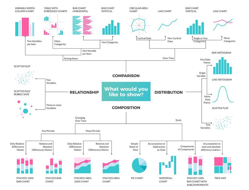
💡 Choosing the right type of visualization is crucial for effectively communicating your findings. Below are some guidelines to help you decide. Check out this resource from UC Berkeley for additional tips.
Example Chart Selection Table
| Question Type | Recommended Chart Type |
|---|---|
| Proportions within a whole | Pie chart, Stacked bar plot, Word cloud |
| Trends over time, sequential events | Line plot, Animated plots |
| Distribution of a variable | Histogram, Box plot (comparing between groups) |
| Comparison across categories | Bar plot, Grouped bar plot (catplot) |
| Relationships between variables | Scatter plot (two variables), Heatmap (multiple variables) |
