💻 PROJECT #2.3: Medical Data Viz with Seaborn
Overview & Setup
In this project, you will visualize and make calculations from medical examination data using matplotlib, seaborn, and pandas. The dataset values were collected during medical examinations.
- Go to the
CS3 Project 2.3assignment on Blackbaud and follow the provided GitHub Classroom link.📁 Clicking the link generates a private repository for your project with the appropriate starter code. Note that projects are stored within the BWL-CS Organization, so you cannot access it from the “Your Repositories” page!
- Open the repository in a Codespace whenever you spend time working on the program, in class or at home.
⚠️ Always remember to
commit changesafter every coding session! - When your project is complete, submit the link to your repository in the
CS3 Project 2.3assignment on Blackbaud.
STARTER CODE
import pandas as pd
import seaborn as sns
import matplotlib.pyplot as plt
import numpy as np

# Import data
df = None

# Add 'overweight' column
df['overweight'] = None

# Normalize data by making 0 always good and 1 always bad. If the value of 'cholesterol' or 'gluc' is 1, make the value 0. If the value is more than 1, make the value 1.


# Function to draw Categorical Plot
def draw_cat_plot():
  # Create DataFrame for cat plot using `pd.melt` using just the values from 'cholesterol', 'gluc', 'smoke', 'alco', 'active', and 'overweight'.
  df_cat = None

  # Group and reformat the data to split it by 'cardio'. Show the counts of each feature. You will have to rename one of the columns for the catplot to work correctly.
  df_cat = None

  # Draw the catplot with 'sns.catplot()'

  # Get the figure for the output
  fig = None

  # Do not modify the next two lines
  fig.savefig('catplot.png')
  return fig


# Function to draw Heat Map
def draw_heat_map():
  # Clean the data
  df_heat = None

  # Calculate the correlation matrix
  corr = None

  # Generate a mask for the upper triangle
  mask = None

  # Set up the matplotlib figure
  fig, ax = None

  # Draw the heatmap with 'sns.heatmap()'

  # Do not modify the next two lines
  fig.savefig('heatmap.png')
  return fig


# RUN FUNCTIONS
draw_cat_plot()
draw_heat_map()
Data description
The rows in the dataset represent patients and the columns represent information like body measurements, results from various blood tests, and lifestyle choices. You will use the dataset to explore the relationship between cardiac disease, body measurements, blood markers, and lifestyle choices.
File name: medical_examination.csv
| Feature | Variable Type | Variable | Value Type |
|---|---|---|---|
| Age | Objective Feature | age | int (days) |
| Height | Objective Feature | height | int (cm) |
| Weight | Objective Feature | weight | float (kg) |
| Gender | Objective Feature | gender | categorical code |
| Systolic blood pressure | Examination Feature | ap_hi | int |
| Diastolic blood pressure | Examination Feature | ap_lo | int |
| Cholesterol | Examination Feature | cholesterol | 1: normal, 2: above normal, 3: well above normal |
| Glucose | Examination Feature | gluc | 1: normal, 2: above normal, 3: well above normal |
| Smoking | Subjective Feature | smoke | binary |
| Alcohol intake | Subjective Feature | alco | binary |
| Physical activity | Subjective Feature | active | binary |
| Presence or absence of cardiovascular disease | Target Variable | cardio | binary |
Instructions
Part A
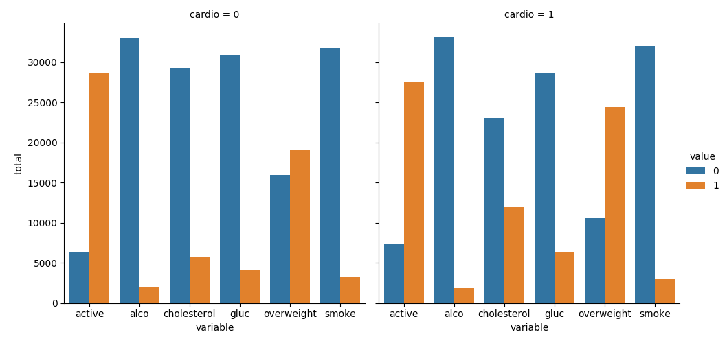
Create a chart where we show the counts of good and bad outcomes for the cholesterol, gluc, alco, active, and smoke variables for patients with cardio=1 and cardio=0 in different panels. Complete the following tasks in main.py:
- Import the data from
medical_examination.csvand assign it to thedfvariable - Create the
overweightcolumn in thedfvariable - Normalize data by making
0always good and1always bad. If the value ofcholesterolorglucis 1, set the value to0. If the value is more than1, set the value to1. - Draw the Categorical Plot in the
draw_cat_plotfunction - Create a DataFrame for the cat plot using
pd.meltwith values fromcholesterol,gluc,smoke,alco,active, andoverweightin thedf_catvariable. - Group and reformat the data in
df_catto split it bycardio. Show the counts of each feature. You will have to rename one of the columns for thecatplotto work correctly. - Convert the data into
longformat and create a chart that shows the value counts of the categorical features using the following method provided by the seaborn library import :sns.catplot() - Get the figure for the output and store it in the
figvariable
Your plot should look like this: 
Part B
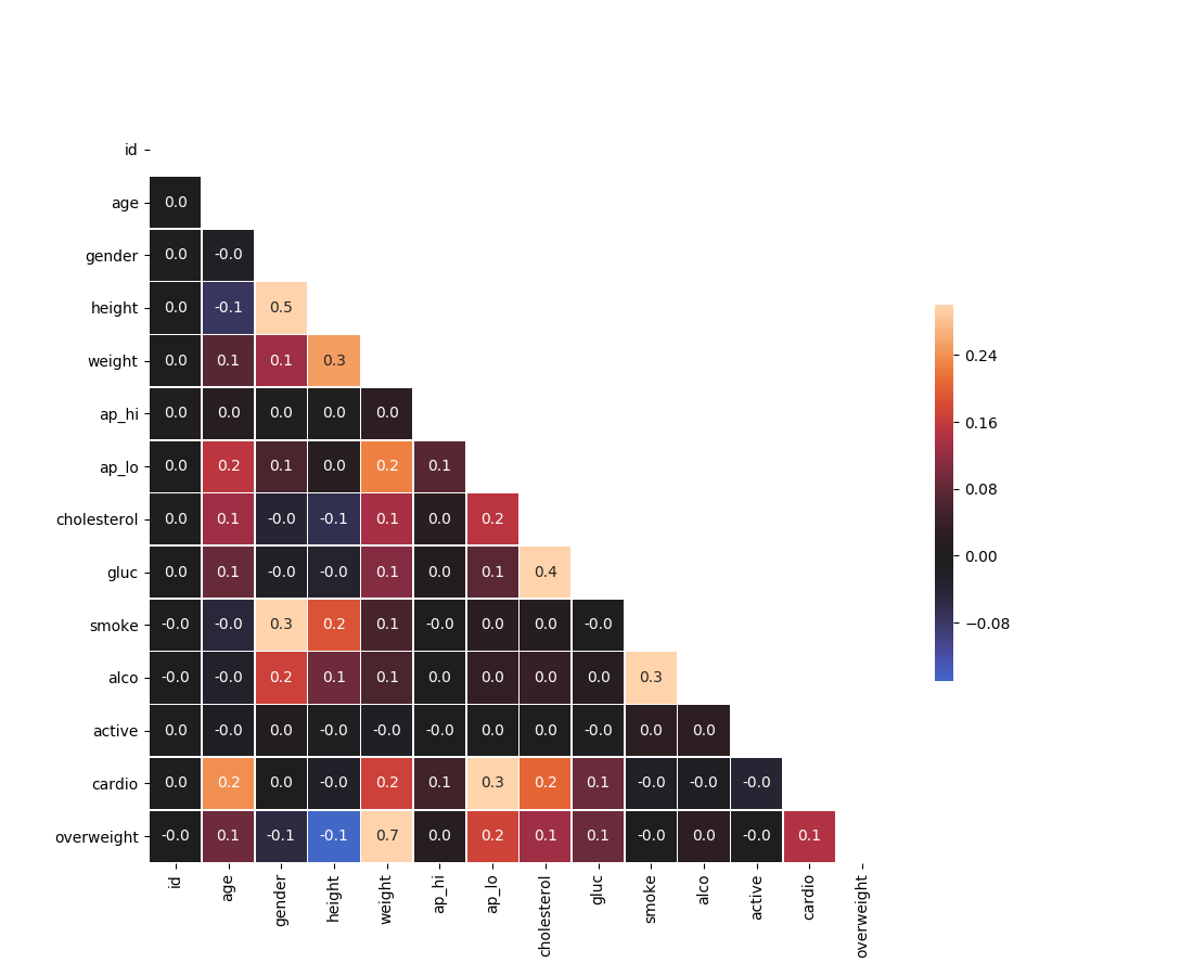
Draw the Heat Map in the draw_heat_map function:
- Clean the data in the
df_heatvariable by filtering out the following patient segments that represent incorrect data:- height is less than the 2.5th percentile (Keep the correct data with
(df['height'] >= df['height'].quantile(0.025))) - height is more than the 97.5th percentile
- weight is less than the 2.5th percentile
- weight is more than the 97.5th percentile
- height is less than the 2.5th percentile (Keep the correct data with
- Calculate the correlation matrix and store it in the
corrvariable - Generate a mask for the upper triangle and store it in the
maskvariable - Set up the
matplotlibfigure - Plot the correlation matrix using the method provided by the
seabornlibrary import:sns.heatmap()- Mask the upper triangle.
Your plot should look like this: 
Acknowledgement
Content on this page is adapted from FreeCodeCamp.