💻 Project #2: Visualize Our Class
Project Overview & Setup
In this project, you will work together to create a pandas DataFrame containing data on each member of the class, which you will later use to create data visualizations using matplotlib.
This project has two phases:
- Collaborative Data Collection: You will work together as a class to design and collect data into a single DataFrame.
- Independent Visualization: You will choose an aspect of the data to create your own data visualization using
matplotlib.
💻 PROJECT PROGRAM SETUP INSTRUCTIONS
- Go to the public template repository for our class: BWL-CS Python Template
- Click the button above the list of files then select
Create a new repository - Specify the repository name:
CS3-Project-ClassViz - Click
Now you have your own personal copy of this starter code that you can always access under the
Your repositoriessection of GitHub! 📂 - Now on your repository, click and select the
Codespacestab - Click
Create Codespace on mainand wait for the environment to load, then you’re ready to code!
🛑 When class ends, don’t forget to SAVE YOUR WORK! Codespaces are TEMPORARY editing environments, so you need to COMMIT changes properly in order to update the main repository for your program.
There are multiple steps to saving in GitHub Codespaces:
- Navigate to the
Source Controlmenu on the LEFT sidebar - Click the button on the LEFT menu
- Type a brief commit message at the top of the file that opens, for example:
updated main.py - Click the small
✔️checkmark in the TOP RIGHT corner - Click the button on the LEFT menu
- Finally you can close your Codespace!
Instructions & Requirements
PART A: Collaborative Data Collection
In this part, the class will work together to design a Pandas DataFrame that contains data on each student. You will be interviewing your classmates to gather this data.
- Choose the Columns for the DataFrame:
- Decide as a class what kinds of data to collect. Examples:
- Name
- Age
- Favorite Subject
- Number of Siblings
- Favorite Movie Genre
- Hours Spent on Hobbies per Week
- GPA
- Favorite Sports Team
- Any other creative data you come up with as a class!
- Decide as a class what kinds of data to collect. Examples:
- Conduct Interviews:
- Each student will interview the rest of the classmates to fill in the data in the Google Sheet.
- Make sure you are accurate and respectful when collecting information.
- Load CSV into a DataFrame:
- File → Download the class data sheet as a
.csvfile. - In your Python program, read the CSV into a pandas DataFrame.
- Example:
df = pd.read_csv('class-data.csv')
- Example:
- File → Download the class data sheet as a
PART B: Independent Data Visualization
Now that we have a class DataFrame, you will each work independently to create your own unique data visualizations. You will choose any subset of the data to visualize using matplotlib. You are free to explore any kind of visualization that helps you understand the data better.
Here are some common types of visualizations that matplotlib can create:
- Bar Chart: Useful for comparing categories of data.
- Line Plot: Great for showing trends over time or continuous data.
- Scatter Plot: Useful for showing the relationship between two variables.
- Pie Chart: Ideal for showing parts of a whole (distribution of categories).
- Histogram: Perfect for showing the distribution of a single variable.
- Choose Your Focus:
- Decide what part of the class DataFrame you want to visualize. This could be:
- A comparison of favorite subjects.
- A bar chart showing the average GPA of students by their favorite sports teams.
- A line plot tracking the number of siblings each student has by age.
- A pie chart showing the distribution of favorite movie genres.
- Decide what part of the class DataFrame you want to visualize. This could be:
- Create Your Visualization:
- Using
matplotlib, create your visualization.- You can clean or filter the data as needed.
- Use
plt.savefig('figure1.png', bbox_inches='tight')to save your figure as a PNG. - Feel free to explore and create as many figures as you want, but check with me to make sure you generate at least ONE type of visualization that no one else in the class is doing!!!
- Using
- Interpret the Visualization:
- In a
''' multi-line comment ''', write a few sentences about what your visualization tells you about the data. - What trends, patterns, or insights can you gather from your chart?
- In a
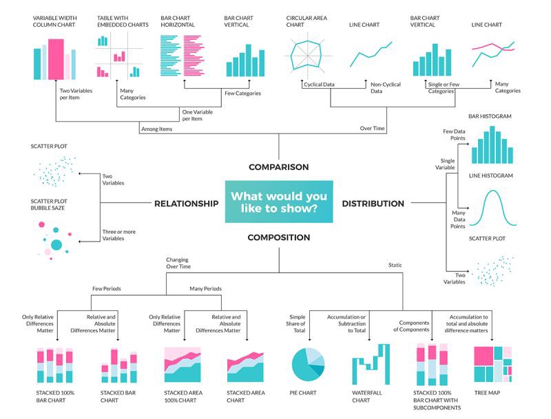
Choosing Appropriate Visualizations 📊
💡 Choosing the right type of visualization is crucial for effectively communicating your findings. Below are some guidelines to help you decide. Check out this resource from UC Berkeley for additional tips.
Example Chart Selection Table
| Question Type | Recommended Chart Type |
|---|---|
| Proportions within a whole | Pie chart, Stacked bar plot, Word cloud |
| Trends over time, sequential events | Line plot, Animated plots |
| Distribution of a variable | Histogram, Box plot (comparing between groups) |
| Comparison across categories | Bar plot, Grouped bar plot (catplot) |
| Relationships between variables | Scatter plot (two variables), Heatmap (multiple variables) |