🎯Unit 2 Challenges
Table of Contents
Pandas Movie Data
Overview & Setup
Data scientists have to deal with a lot of data at once. While Google Sheets and Excel are great ways to visualize and manipulate data, they are not as versatile as we might want. In this project, you will practice using data frames and learn to use them to obtain information from data.
Instructions
PART A: Exploring the Data
We’re going to be using a dataset about movies to try out processing some data with the Pandas library. A Python Library is a collection of related modules. It contains bundles of code that can be used repeatedly in different programs.
- We start with some standard imports:
import pandas as pd import numpy as np - Download the
movies_metadata.csvfile from Kaggle and upload it to your repository. - Load the data from a local file using
pandas:df = pd.read_csv('movies_metadata.csv').dropna(axis=1, how='all') df.head() - Let’s see how much data we have:
df.shape - Twenty-three columns of data for over 45,000 movies is going be a lot to look at, but let’s start by looking at what the columns represent:
df.info()
EXPLANATION OF COLUMNS
- belongs_to_collection: A stringified dictionary that identifies the collection that a movie belongs to (if any).
- budget: The budget of the movie in dollars.
- genres: A stringified list of dictionaries that list out all the genres associated with the movie.
- homepage: The Official Homepage of the movie.
- id: An arbitrary ID for the movie.
- imdb_id: The IMDB ID of the movie.
- original_language: The language in which the movie was filmed.
- original_title: The title of the movie in its original language.
- overview: A blurb of the movie.
- popularity: The Popularity Score assigned by TMDB.
- poster_path: The URL of the poster image (relative to http://image.TMDB.org/t/p/w185/).
- production_companies: A stringified list of production companies involved with the making of the movie.
- production_countries: A stringified list of countries where the movie was filmed or produced.
- release_date: Theatrical release date of the movie.
- revenue: World-wide revenue of the movie in dollars.
- runtime: Duration of the movie in minutes.
- spoken_languages: A stringified list of spoken languages in the film.
- status: Released, To Be Released, Announced, etc.
- tagline: The tagline of the movie.
- title: The official title of the movie.
- video: Indicates if there is a video present of the movie with TMDB.
- vote_average: The average rating of the movie on TMDB.
- vote_count: The number of votes by users, as counted by TMDB.
PART B: Filtering the Data
Let’s start by only looking at films that cost over a million dollars to make.
Create a variable called budget_df that pulls the entire row (contains all columns) for any movies whose value in the 'budget' column was over a million dollars.
# Fill in brackets with a CONDITIONAL
budget_df = df[]
print(budget_df.shape)
💬: How many movies have a budget over 1 million dollars?
With this more manageable list of 7000+ movies, I’d like to have a way to look up the budget of a particular movie.
Create a Series object called budget_lookup such that you are able to use a call to budget_lookup['Movie Title'] to find the budget of that movie.
# Fill in the parameters for (values, index)
budget_lookup = pd.Series()
Print out the first five rows of the budget_lookup Series.
💬: What was the budget for Jumanji?
Let’s say I have figured out that the first (alphabetically) movie whose title starts with an “A” is “A Bag of Hammers” and the last movie that starts with a “B” is “Byzantium”.
# Get FIRST movie whose title starts with A
budget_lookup[budget_lookup.index.str.startswith('A')].sort_index()[[0]]
# Get LAST movie whos title starts with B
budget_lookup[budget_lookup.index.str.startswith('B')].sort_index()[[-1]]
Use that knowledge to create a Series that contains budget data for all the movies that start with an “A” or a “B”.
Hint: No need to use
startswithlike I did above, just use the two movie titles I found and comparebudget_lookup.indexto them.
# First define the condition to be checked
condition =

# Pull rows conditionally
budget_lookup_A_B = budget_lookup[condition]
💬: How many movies with a budget of over a million dollars AND whose title starts with an “A” or a “B” are there?
PART C: Numbers as Indices
Enough about movie budgets, it’s time to budget my time instead. Because I schedule my day to the minute, I like to be able to look up movies by their runtime, so that when I have a spare two hours and 34 minutes, I can find all the movies that would fit precisely in that time slot. (Popcorn-making time is budgeted separately).
Before you start, here is a refresher on the index operator in Pandas:
Selecting Columns of a DataFrame
df[<string>]gets me a column and returns the Series corresponding to that column.df[<list of strings>]gets me a bunch of columns and returns a DataFrame.
Selecting Rows of a DataFrame
df[<series/list of Boolean>]gets me the rows for each element in the list like thing you passed me that isTrue. However, I think this is confusing and whenever you want to select some rows of a DataFrame you should usedf.loc[].df.loc[<series/list of Boolean>]behaves just likedf[<series/list of Boolean>].df.loc[<string>]uses the non-numeric row index and returns the row(s) for that index value.df.loc[<string1>:<string2>]uses the non-numeric index and returns a data frame composed of the rows starting with string1 and ending with each string2.df.loc[<list/Series of strings>]returns a data frame composed of each row from df with an index value that matches a string in the list.
If you use an integer in any of the last four examples, it works just like the string, but the index values are numeric instead. What is important (and confusing) about this is that they use the index, not the position. So, if you create a data frame with 4 rows of some data, it will have an index that is created by default where the first row starts with 0, the next row is 1 and so on. However, if you sort the data frame such that the last row becomes the first and the first row becomes the last, using df.loc[0] on the sorted data frame will return the last row.
If you want to be strictly positional, you should use df.iloc[0], which will return the first row regardless of the index value. df.iloc[0:5] is the same as doing df.head(), and df.iloc[[1, 3, 5, 7]] will return four rows: the 2nd, 4th, 6th and 8th.
df = pd.DataFrame({'a':list("pythonrocks"), 'b':[1,2,3,4,5,6,7,8,9,10,11]})
df = df.set_index('a')
df.loc['p':'n']
OK, but what if we do this:
df.loc['p':'o']
Pandas raises an error because there are two ‘o’s in the index. It doesn’t know which one you mean, first? last? If you argue it should use the last then consider the performance implications if this was a really large index? In that case it would be very time consuming to search the index for the last occurance.
On the other hand, if we sort the index then the last instance can be found quite quickly, and with a sorted index loc will work for this example.
df = df.sort_index()
df.loc['c':'o']
-
Create a Series called
movies_by_runtimethat is indexed by runtime and has the movie’s title as its values. Note that you will need to usesort_index()in order to be able to look up movies by their duration. Base yourself on the originaldfrather thanbudget_df. -
While you’re at it, filter to excluse any movie that is less than 10 minutes (you can’t get into it if it’s too short) or longer than 3 hours (who’s got time for that?).
Hint: You may MAY to use
pd.to_numericto force the runtimes to be numbers (instead of strings).
Here is a simpler example that shows the movies that are exactly 7 minutes long:
movies_by_runtime = pd.Series(df['title'].values, index=df['runtime'])
movies_by_runtime = movies_by_runtime.sort_index()
print(movies_by_runtime.loc[7])
💬: How many movies lasting exactly 154 minutes are there?
💬: What is the 155th shortest movie in this collection? (Make sure you are using
ilocand notloc!)
PART D: Dealing with Multiple DataFrames
Forget about budget or runtimes as criteria for selecting a movie, let’s take a look at popular opinion. Our dataset has two relevant columns: vote_average and vote_count.
Let’s create a variable called df_high_rated that only contains movies that have received more than 20 votes, and whose average score is greater than 8.
df_highly_voted = df[df.vote_count > 20]
df_high_rated = df_highly_voted[df_highly_voted.vote_average > 8]
df_high_rated[['title', 'vote_average', 'vote_count']].head()
Here we have some high-quality movies, at least according to some people.
💬: How many highly-rated movies are in this dataset?
But what about my opinion?
Here are my favorite movies and their relative scores. Create a DataFrame called compare_votes that contains the title as an index and both the vote_average and my_vote as its columns. Also, only keep the movies that are both my favorites and popular favorites.
Hint: You’ll need to create two Series, one for my ratings and one that maps titles to vote_average.
my_votes = {
       "Star Wars": 9,
       "Paris is Burning": 8,
       "Dead Poets Society": 7,
       "The Empire Strikes Back": 9.5,
       "The Shining": 8,
       "Return of the Jedi": 8,
       "1941": 8,
       "Forrest Gump": 7.5,
   }
💬: What’s the percentage difference between the popular rating for Star Wars and my vote for it? (Make sure you use the popular rating minus my rating, and convert your answer to a percentage.)
💬: Make up 3 questions you would like to answer about this movie data using the techniques you have learned.
Visualize Our Class
Overview & Setup
In this project, you will work together to create a Pandas DataFrame containing data on each member of the class, which you will later use to create data visualizations using matplotlib. This assignment has two parts:
- Collaborative Data Collection: You will work together as a class to design and collect data into a single DataFrame.
- Independent Visualization: You will choose an aspect of the data to create your own data visualization using
matplotlib.
Instructions
🐼 Part A: Collaborative Data Collection
In this part, the class will work together to design a Pandas DataFrame that contains data on each student. You will be interviewing your classmates to gather this data.
- Choose the Columns for the DataFrame:
- Decide as a class what kinds of data to collect. This could include basic information such as:
- Name
- Age
- Favorite Subject
- Number of Siblings
- Favorite Movie Genre
- Hours Spent on Hobbies per Week
- GPA
- Favorite Sports Team
- Any other creative data you come up with as a class!
- Decide as a class what kinds of data to collect. This could include basic information such as:
- Conduct Interviews:
- Each student will interview the rest of the classmates to fill in the data for the DataFrame.
- Make sure you are accurate and respectful when collecting information.
- Create the DataFrame:
- Once all the data is collected, combine it into a Pandas DataFrame. This can be done by sharing the data and using Python code to structure it.
- Example of creating a simple DataFrame:
data = {
    'Name': ['Alice', 'Bob', 'Charlie'],
    'Age': [17, 18, 17],
    'Favorite Subject': ['Math', 'History', 'Biology']
}
df = pd.DataFrame(data)
- Save the DataFrame:
- Save the class DataFrame into a CSV file that everyone can access.
- Example of saving the DataFrame to a file:
df.to_csv('class_data.csv', index=False)
📊 Part B: Independent Data Visualization
Now that we have a class DataFrame, you will each work independently to create your own unique data visualizations. You will choose any subset of the data to visualize using matplotlib. You are free to explore any kind of visualization that helps you understand the data better.
Here are some common types of visualizations that matplotlib can create:
- Bar Chart: Useful for comparing categories of data.
- Line Plot: Great for showing trends over time or continuous data.
- Scatter Plot: Useful for showing the relationship between two variables.
- Pie Chart: Ideal for showing parts of a whole (distribution of categories).
- Histogram: Perfect for showing the distribution of a single variable.
- Choose Your Focus:
- Decide what part of the class DataFrame you want to visualize. This could be:
- A comparison of favorite subjects.
- A bar chart showing the average GPA of students by their favorite sports teams.
- A line plot tracking the number of siblings each student has by age.
- A pie chart showing the distribution of favorite movie genres.
- Decide what part of the class DataFrame you want to visualize. This could be:
- Create Your Visualization:
- Using
matplotlib, create your visualization.- You can clean or filter the data as needed.
- Use
plt.savefig('figure1.png', bbox_inches='tight')to save your figure as a PNG. - Feel free to explore and create as many figures as you want, but check with me to make sure you generate at least ONE type of visualization that no one else in the class is doing!!!
- Using
- Interpret the Visualization:
- In a
''' multi-line comment ''', write a few sentences about what your visualization tells you about the data. - What trends, patterns, or insights can you gather from your chart?
- In a
Medical Data with Seaborn
Overview & Setup
In this project, you will visualize and make calculations from medical examination data using matplotlib, seaborn, and pandas. The dataset values were collected during medical examinations.
STARTER CODE
import pandas as pd
import seaborn as sns
import matplotlib.pyplot as plt
import numpy as np

# Import data
df = None

# Add 'overweight' column
df['overweight'] = None

# Normalize data by making 0 always good and 1 always bad. If the value of 'cholesterol' or 'gluc' is 1, make the value 0. If the value is more than 1, make the value 1.


# Function to draw Categorical Plot
def draw_cat_plot():
  # Create DataFrame for cat plot using `pd.melt` using just the values from 'cholesterol', 'gluc', 'smoke', 'alco', 'active', and 'overweight'.
  df_cat = None

  # Group and reformat the data to split it by 'cardio'. Show the counts of each feature. You will have to rename one of the columns for the catplot to work correctly.
  df_cat = None

  # Draw the catplot with 'sns.catplot()'

  # Get the figure for the output
  fig = None

  # Do not modify the next two lines
  fig.savefig('catplot.png')
  return fig


# Function to draw Heat Map
def draw_heat_map():
  # Clean the data
  df_heat = None

  # Calculate the correlation matrix
  corr = None

  # Generate a mask for the upper triangle
  mask = None

  # Set up the matplotlib figure
  fig, ax = None

  # Draw the heatmap with 'sns.heatmap()'

  # Do not modify the next two lines
  fig.savefig('heatmap.png')
  return fig


# RUN FUNCTIONS
draw_cat_plot()
draw_heat_map()
Data description
The rows in the dataset represent patients and the columns represent information like body measurements, results from various blood tests, and lifestyle choices. You will use the dataset to explore the relationship between cardiac disease, body measurements, blood markers, and lifestyle choices.
File name: medical_examination.csv
| Feature | Variable Type | Variable | Value Type |
|---|---|---|---|
| Age | Objective Feature | age | int (days) |
| Height | Objective Feature | height | int (cm) |
| Weight | Objective Feature | weight | float (kg) |
| Gender | Objective Feature | gender | categorical code |
| Systolic blood pressure | Examination Feature | ap_hi | int |
| Diastolic blood pressure | Examination Feature | ap_lo | int |
| Cholesterol | Examination Feature | cholesterol | 1: normal, 2: above normal, 3: well above normal |
| Glucose | Examination Feature | gluc | 1: normal, 2: above normal, 3: well above normal |
| Smoking | Subjective Feature | smoke | binary |
| Alcohol intake | Subjective Feature | alco | binary |
| Physical activity | Subjective Feature | active | binary |
| Presence or absence of cardiovascular disease | Target Variable | cardio | binary |
Instructions
Part A
Create a chart where we show the counts of good and bad outcomes for the cholesterol, gluc, alco, active, and smoke variables for patients with cardio=1 and cardio=0 in different panels. Complete the following tasks in main.py:
- Import the data from
medical_examination.csvand assign it to thedfvariable - Create the
overweightcolumn in thedfvariable - Normalize data by making
0always good and1always bad. If the value ofcholesterolorglucis 1, set the value to0. If the value is more than1, set the value to1. - Draw the Categorical Plot in the
draw_cat_plotfunction - Create a DataFrame for the cat plot using
pd.meltwith values fromcholesterol,gluc,smoke,alco,active, andoverweightin thedf_catvariable. - Group and reformat the data in
df_catto split it bycardio. Show the counts of each feature. You will have to rename one of the columns for thecatplotto work correctly. - Convert the data into
longformat and create a chart that shows the value counts of the categorical features using the following method provided by the seaborn library import :sns.catplot() - Get the figure for the output and store it in the
figvariable
Your plot should look like this: 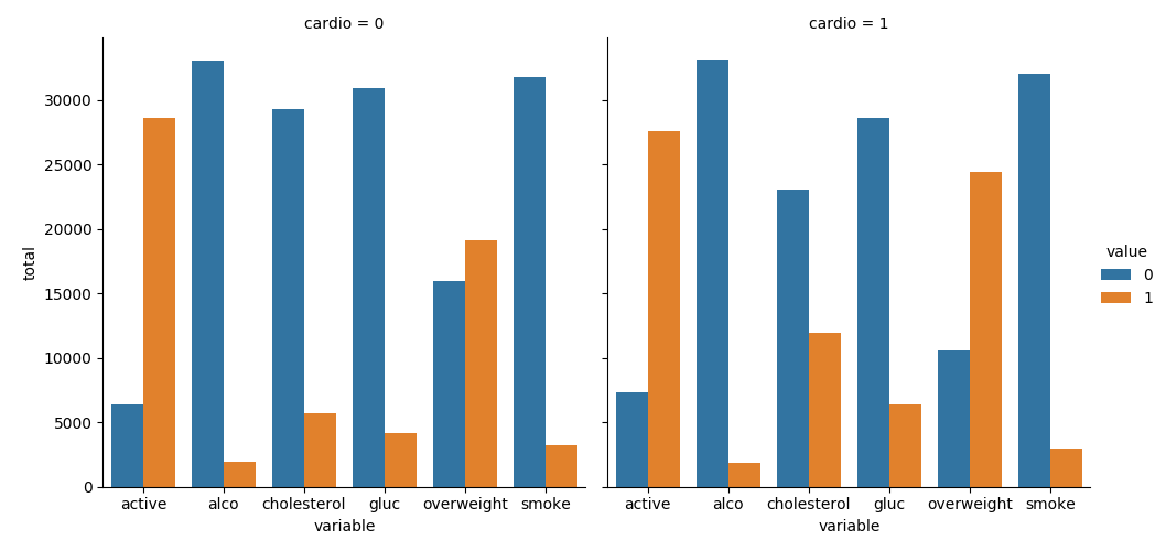
Part B
Draw the Heat Map in the draw_heat_map function:
- Clean the data in the
df_heatvariable by filtering out the following patient segments that represent incorrect data:- height is less than the 2.5th percentile (Keep the correct data with
(df['height'] >= df['height'].quantile(0.025))) - height is more than the 97.5th percentile
- weight is less than the 2.5th percentile
- weight is more than the 97.5th percentile
- height is less than the 2.5th percentile (Keep the correct data with
- Calculate the correlation matrix and store it in the
corrvariable - Generate a mask for the upper triangle and store it in the
maskvariable - Set up the
matplotlibfigure - Plot the correlation matrix using the method provided by the
seabornlibrary import:sns.heatmap()- Mask the upper triangle.
Your plot should look like this: 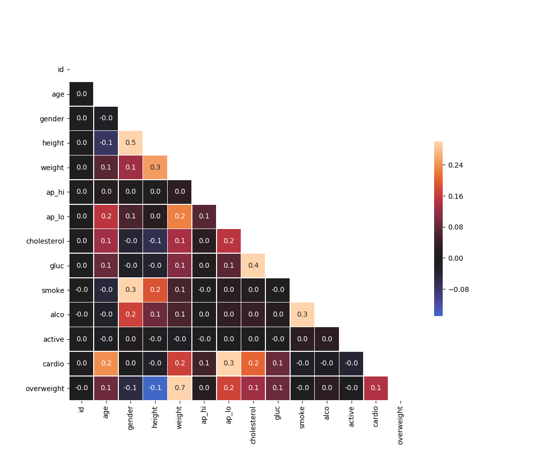
Acknowledgement
Content on this page is adapted from How to Think Like a Data Scientist on Runestone Academy - Brad Miller, Jacqueline Boggs, and Jan Pearce and FreeCodeCamp.